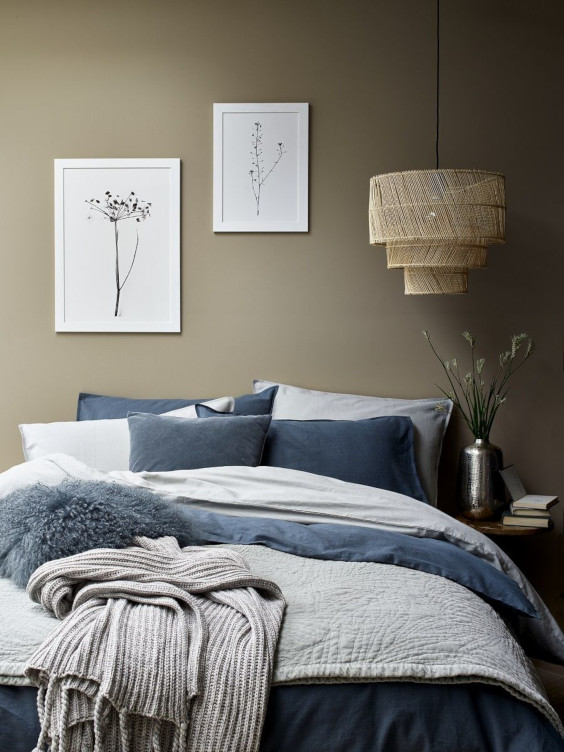
Scandinavian Colour Schemes: How Do Scandinavian Countries Compare?
There are a few things the Nordic countries all have in common: excellent coffee, high taxes, exceptional pastries, and long dark winters. Even design-wise there are plenty of similarities between countries. But, colour schemes aren’t necessarily one of those elements.
In this article, we’re going to take you through those colour differences, as well as some of the differences in general when it comes to Scandinavian design in respective countries.
Scandinavian Colours as a whole
Overall, Scandinavian design is characterised by more subtle and muted colours. Think greys, white, and blues. In the last few years, more colour has been creeping in. But, even those are still quite neutral.
Pastel and dusty colours such as lighter blues, pink, and even orange are gracing the walls of Scandinavian homes. Country dependent, of course.
Why Is Colour so Important in Scandinavian homes?
Before we get into the intricate differences between the Scandinavian countries and their decor choices, you might be wondering why colour plays such an important role in Scandinavian interior design to begin with…
There are a few key reasons why colour is so important in Scandinavian homes. Winters are darker and longer, meaning there isn’t so much natural light. As a result, you want to make as much use of natural light as possible, whilst still keeping an inviting and bright feel in your home when it’s dark outside.
Naturally, colours that tend to reflect light or give a bright feel within the space tend to be more neutral - whites, blues, or pastel colours. Hence, these became the staple of Scandinavian interiors.
Did you know that wall colour normally gets picked last? This is due to the focus that’s placed on furniture within Scandinavian homes.
In order to make the most of the space available in Scandinavian homes, it’s necessary to make sure every piece of furniture and every accessory count. Each piece really earns its place in the home, and there’s no room for clutter or nick-nacks.
The lack of clutter and emphasis on clean lines and spaces where possible means that wall art is a great way to add some colour and personality without taking up precious square meter space. Why not take a look at our best selling posters to get some inspiration?
Or if you’ve already got something in mind, then why not browse by colour:
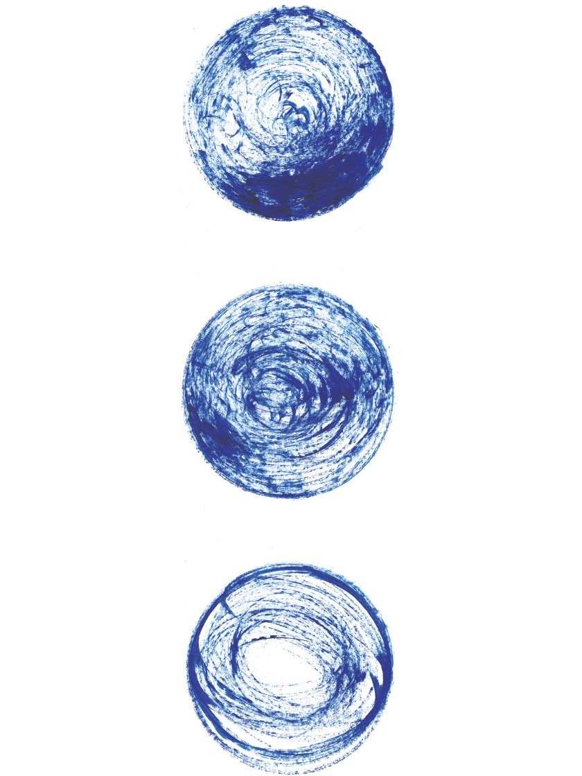
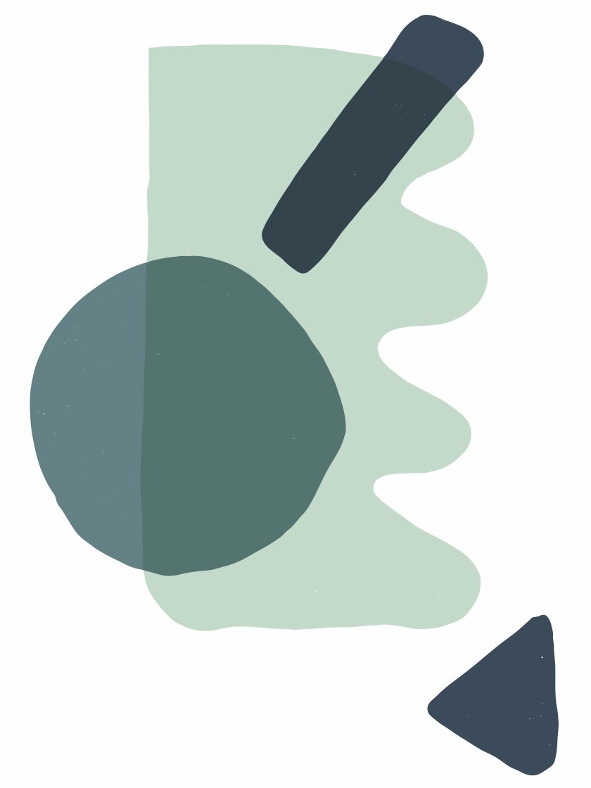
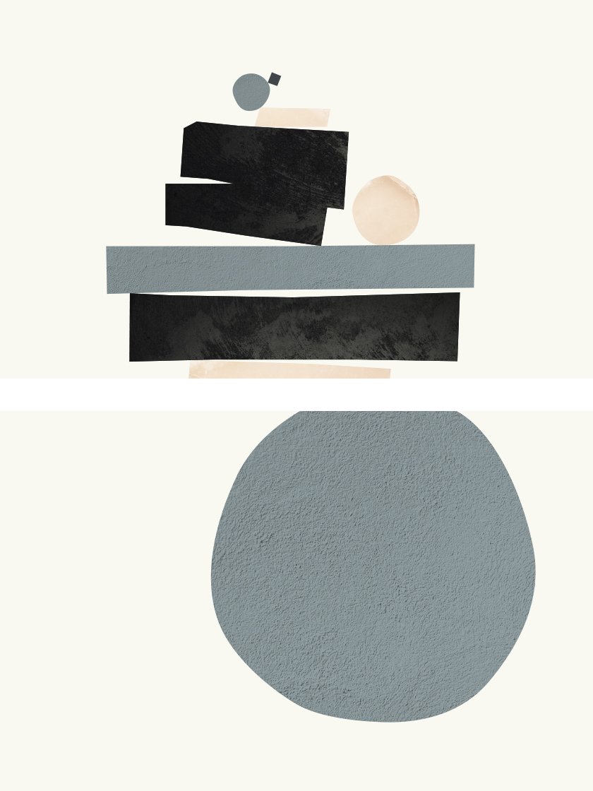
Denmark
Danish design is heavily influenced by the German Bauhaus movement which the Danes took and added their own twist to. By the 1950s, the Bauhaus movement was well and truly the foundation for what we know as the Scandinavian design movement.
Out of the three neighbours, it’s safe to say that Denmark probably puts the most emphasis upon furniture. Especially when it comes to the sheer output and number of names that are famous for their design work. They also tend to be the most put together or restrained when it comes to interior design choices.
Of course, this doesn’t mean that Danish interior design is boring, middle of the road, or a bit uninspired - it’s absolutely the opposite. Just in comparison to their neighbours, there’s a more image-conscious approach.
Sweden
Of all our countries, Sweden would probably be considered as having the most eccentric style in terms of colour choices and their boldness. It’s not uncommon to see walls adorned with whites, blues, or pastel colours, much like their slightly more subdued neighbours Denmark but also yellows and greens. Even reds, purples, and gold are not an unusual sight.
This even shows through in possibly the most well known Swedish furniture store the world over - IKEA. They’re known for their eccentric patterns and bold colours, and there’s something suitable to everyone’s taste.
Along with its slightly bolder colour choices in general, Sweden is known for its craftier elements such as vases and glasswork.
Norway
Compared to its Nordic neighbours Denmark and Sweden, Norwegians are a bit less image-conscious when it comes to decorating their interiors. It’s rather common for both new and old to be mixed and blended together. Of course, like all Nordics, there’s still strong elements of wood, clean lines, and a somewhat minimalist feel when it comes to the amount of decor.
However, this less image-conscious interior approach means that there can be some truly kitschy and chic results.
Wood, in fact, also seems to be more of a staple in Norwegian design when compared to its neighbours. Adding wooden cladding to walls isn’t unusual in Norwegian homes, with some deciding to leave it bare, or paint more neutral colours like you would a regular wall.
Sounds nice, but what if I can’t paint my walls?
We thought you might ask that, so we’re going to explore how you can inject some colour and personality without cracking out the paint rollers!
If you’re not in the position to be able to paint your walls (either because you’ve just redecorated, or you’re renting so you can’t make drastic interior design changes), then why not look into posters and wall art?
We’ve plenty of posters for you to choose from at Project Nord so there’s sure to be something that takes your fancy. Why not take a look at our posters and see what catches your eye? Or have a look at the links above if you’ve already got your perfect colour in mind.
These days you don’t even necessarily need a nail and hammer to start hanging things. Using something like 3M picture hanging strips, you’ll have your posters up in no time with not holes to worry about filling in down the line before you move out.
Hopefully, you’ve found this look at Scandinavian colour schemes insightful, and you’ve got some inspiration to begin developing your own Scandinavian themed space. If you need some more inspiration or want to learn more about Scandinavain interior design, then why not read some of our other blog posts?
Written by Jack Luke Fitzsimons
Images sourced from Pintrest and Project Nord website.


