
The Ultimate Guide to Typography: From A to Z

Poster by Tres Tipos Gráficos in collaboration with Manuel Sesma.
Typography is always around us. It helps us understand the things we read and can even change the way we feel about the information it relays.
And yet, to the untrained eye, it seems invisible. Typography is often so well-suited to the environment it's used in, that we don’t notice it at all. Let’s change that!
What is typography?
Typography is the style and appearance of printed matter.
In other words, typography is the design of the words presented to us. Of course, words written down can have many functions. So, there has to be a range of typographic choices to suit what the text means.
In this article, we’ve created the complete guide to typography. We’ll begin by investigating how it all started and navigate up to our favourite typefaces. Project Nord has a whole collection of Typographic Posters. So, if this all seems like a bit of you, have a browse!
A Short History of Typography
To kick-off, let’s take a look at the major milestones in typography! From written scripts up to computer-generated designs, each stage in typographic history has lead us to where we are today.
Before typography, the rule of script (780 - 1200 AD)
Of course, texts existed way before typography was a discipline! A lot of our first documents were religious texts, so were hand-scribed by monks.
You might think that as they were written by hand, texts looked different from one another. Think again! Uniform scripts developed so that texts were easier to understand across regions. Let's take Europe as an example. Carolingian minuscule became the predominant script for European texts. Alcuin of York, a Benedictine Monk, developed the script in 780 AD. It was a huge leap from what had come before. Carolingian minuscule introduced spacing between words, lower case letters, and punctuation! It's design focused on readability and clarity. Some may argue that Carolingian minuscule was therefore one of our first typefaces!
Despite this development, there was still room for major improvements. Hand-writing books took a huge amount of time and energy. This made them very expensive to produce. Plus, if it wasn't a religious text, who would have the patience to write so much? New techniques had to be invented!


Bi Sheng - inventor of the world’s first movable type printing technology (1040 AD)
One of the first innovations in type happened in China around the year 1040 AD. An artisan called Bi Sheng came up with the first moveable type printing technology. The world would be a different place if it wasn’t for this man!
So, what exactly did Bi Sheng’s invention look like? He started with sticky clay and carved individual characters from it. After, he baked them so they hardened. He made ink from a mix of pine resin, wax, and paper ashes. The characters were then put together to form words and used to print!
Remember, the Chinese alphabet is much more complex than the Latin one. Therefore, Bi Sheng had to make hundreds of different characters! This method was used in China for a while afterwards but didn’t go mainstream for a couple of hundred years.
It’s important that we remember Bi Sheng’s name! His moveable type technology made texts, so therefore information, accessible to common people. His invention was the beginning of the mass spread of knowledge. Bi Sheng was a true revolutionary!

Page from the Gutenberg Bible, 1450s. One of the first mass-printed books.
Johannes Gutenberg - moveable type debuts in Europe (1450 AD)
Johannes Gutenberg was a goldsmith and craftsman working in Strasbourg, Germany. After experimenting with wood-block printing, Gutenberg was left frustrated. He was sure there had to be a more efficient method of printing!
To solve his dilemma, he produced individual printing characters, just like Bi Sheng. Instead of clay, Gutenberg used metals to cast moveable blocks. In the process, he produced the first latinate, printing typeface!
The typeface was based on Blackletter, a script developed from Carolingian minuscule. It was dramatic-looking, featuring thick and thin lines with ornamental serifs. In some countries like Germany, Blackletter was still in use up to the twentieth century!
Gutenberg did not stop there. He also created press technology to mechanise the printing process. Suddenly, it was possible to print customisable pages of text quickly and cheaply. It was a transformation!
European alphabets were easy to work thanks to their few characters. So, by 1450, the press was in action and quickly became very popular!
Nicholas Jenson - creator of early Roman typefaces (1470 AD)
After the invention of Gutenberg’s printing press, the world of typography had just begun. Innovators were keen to learn about this new technology and had some ideas of their own.
Nicholas Jenson started his career as a Master of the French Royal Mint. However, after the invention of the printing press, he wanted in on the action. He went to Mainz to learn the craft and then to Venice to open his own printing shop in 1470.
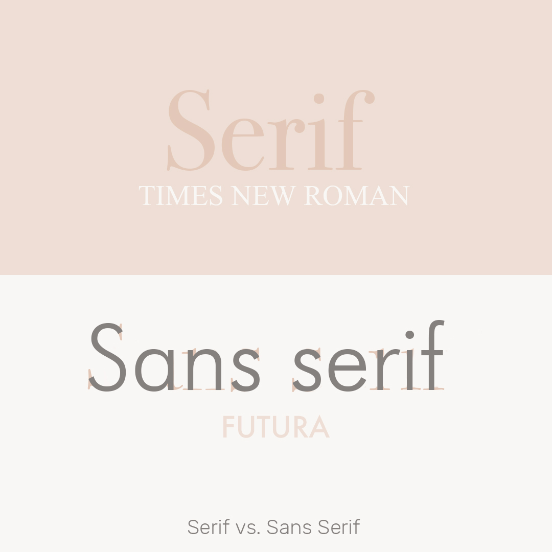
Whilst living in Italy, Jenson was inspired by the lettering carved into ancient Roman buildings. The type featured straight lines and regular curves. It was clean, easy to read, and had a weight of importance to it. Over the following years, Jenson developed Roman type, rebirthing Latin inscription! His work is still hugely popular today. Just look at Times New Roman for example!

Paul Renner - designer of Futura, the first wide-spread sans serif font (1927 AD)
Now, let’s fast-forward to the 20th century.
In the intervening years, typographers, printers, and designers experimented with countless typefaces. One such experimentation was getting rid of the serifs, the ornamental flicks, from letterings. This sort of typeface was to have a new name. Sans Serif - without serif.
Sans serif typefaces still dominate today. For example, the hugely popular Futura was created way back in 1927. Paul Renner, its designer, wanted to create a typeface based on geometric shapes. Renner was German and around at the same time as the Bauhaus School. Though he wasn’t associated with it, his work aligns well with the movement. Futura is clean and sleek. Which is perhaps why its one of the most popular fonts of the twentieth century. It was even used on the Apollo Moon Landing plaque!
how we created our TYpography Collection!
With the explosion of the internet, there have been so many new environments typefaces had to be invented for.
Typography has also developed into an art form! Here at Project Nord, we love being inspired by typefaces and what they represent. Just take a look at our collection of Typographic Posters! If you like what you’ve read so far, you’re sure to find something you’ll be inspired by too!
Did you know that Project Nord’s first collection was Swiss Typographic posters? We spoke more about the process behind our posters in our Behind the Scenes at Project Nord article. Check it out!


Typography Terms You Need to Know
Now that we have an understanding of what typography is all about, let’s get technical! We’ve come up with this guide to all the typographic terms you need to know.
Typefaces are designed with more variables than we could possibly think of. Each variable has its own names. Here they are...
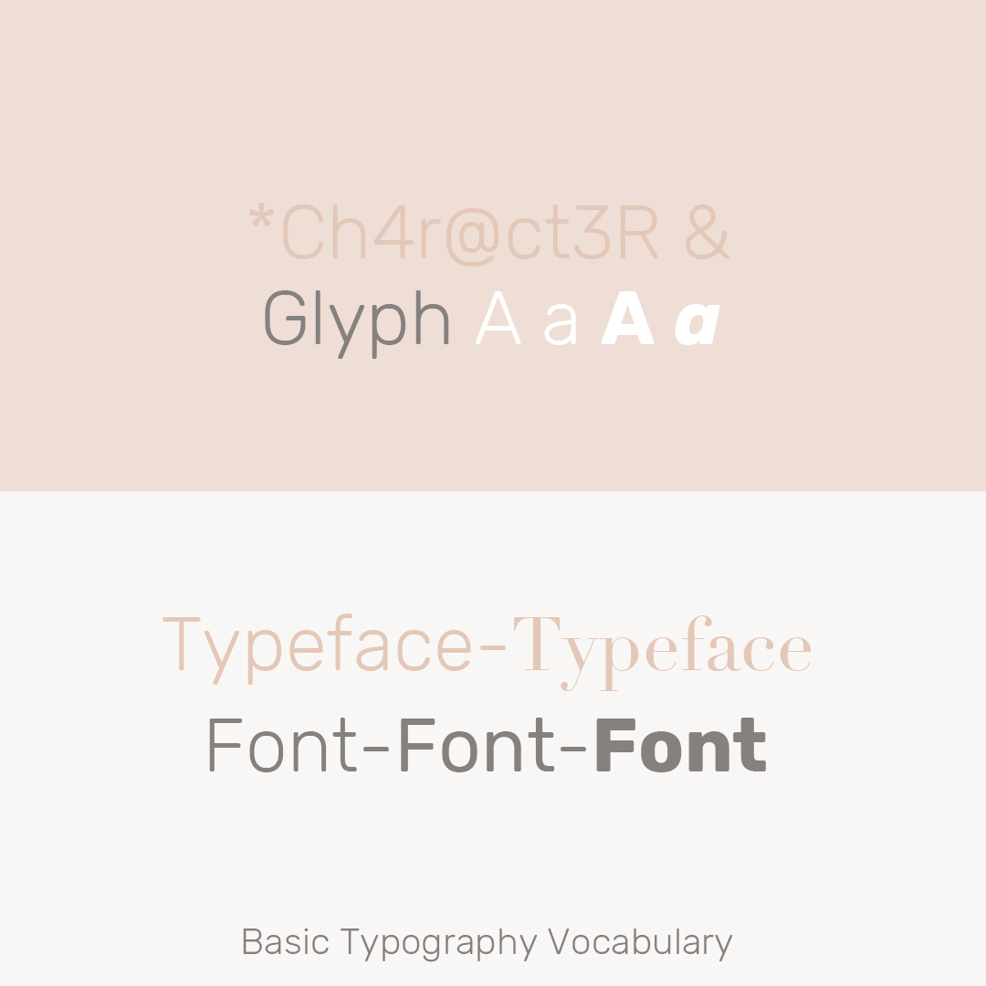
Basic Typography Vocabulary
Let’s start with the basics. Have you ever wondered what the difference between a typeface and a font is? We have the answers!
Character, individual letters, signs, or symbols.
Glyph, the specific shape or design of a given character.
Typeface, a set of characters all designed in the same style. For example, Times New Roman is a typeface.
Font, a set of characters in the same typeface which are also in the same family. Bold and italic characters may be in the same typeface, but different fonts. This is because bold characters and italic characters are in different families.
Character widths
So, we now know the basic terms. Let’s go onto something a little more serious! Different typefaces deal with the width of each character or glyph differently. Here are your options.
Proportional typefaces, where glyphs might be of different sizes. For example, an ‘i’ has a smaller width than an ‘o’ in Times New Roman.
Monospaced typefaces, where glyphs are all a standard size. For example, in the typeface Courier.


Character spacing
You can also alter how characters are spaced when they’re presented next to each other. Some characters sit better with each other than others. Therefore, there are different spacing adjustments you can make depending on how you want them to look.
Tracking, leaving the spacing as it is. This can sometimes look awkward if some characters touch each other and others don’t.
Kerning, adjusting the spacing between certain characters so they fit together better.
Metrics
And finally, we’ve got metrics. This is how different typefaces or individual characters are designed to sit on horizontal lines.

Baseline, the line most letters sit on, such as ‘e’.
Descender, the parts of letters that dip below the baseline like ‘j’, ‘y’, and ‘g’. The lowest point of each descender is called the ‘descender height.’
Midline, the top of most letters, such as ‘e’.
Caps height, the line capital letters go up to.
Ascender, the parts of letters that go above the midline like ‘h’, ‘k’, and ‘l’. These are sometimes the same as the caps height, but not always. The highest point of each ascender is called the ‘ascender height.’
Our Favourite Fonts and their Fascinating Beginnings
For this final part of the article, we wanted to share our favourite typefaces with you. The more specific the situation they’re designed for, the more fascinating the outcome is. Just take a look!
Johnston - one of the world’s longest-lasting examples of corporate branding by Edward Johnston (1913)
If you live in London, you’ll come in contact with this typeface every day! That’s right, it’s the lettering used for the London Underground!
This typeface was commissioned in 1913 in an attempt to strengthen the company’s corporate identity. Edward Johnston was the man for the job. He created a sans serif typeface which still seems fresh over one hundred years later!
The typeface has gone through different versions since it was originally designed. For the Underground’s 100th birthday, Johnson 100 was developed. This version restored some of the original design features which had been lost over the years. Also, to keep up with the times, it added the hashtag symbol and had new weights hairline and thin for digital use!
London Underground merchandise is sold all over the world and is instantly recognisable to many. Johnston is a truly timeless typeface.


Bell Centennial - the phone book typeface by Matthew Carter (1975-1978)
Remember the phone book? That big brick of papers that used to hold all our names, numbers, and addresses? Even the phone book had a typeface designed specifically for it. This one is truly fascinating.
Just think the features of a phone book. The type is tiny, the paper is super thin. Plus, as they were produced on mass, the printing method was really fast. Therefore, Matthew Carter had to keep all these specifics in mind when he created Bell Centennial. He even studied the way ink bled on the paper and adopted the typeface to fit. So, when you see the lettering blown up, it looks like there are missing pixels at the intersections between strokes. So clever!
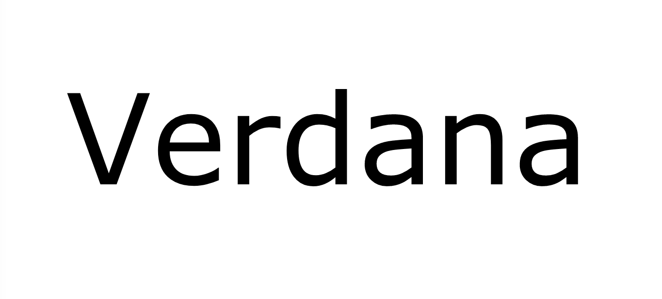
Verdana - A readable type for computer screens, again by Matthew Carter (1996)
Another innovation by Matthew Carter came in 1996. This time, he was comissioned by Microsoft to create a reading font for digitised screens.
There were a number of reasons why serif fonts didn’t suit computers. Firstly, they were hard to read when sized down, so weren’t flexible. Also, serif fonts took up a lot of data on a computer’s memory because of their complex curved design. Therefore, Carter created Verdana, a serif font which was both highly legible and took up much less space.
Weingart style - Created by Wolfgang Weingart, the Father of Punk Swiss Typography
For our final typeface, we thought we’d finish on something truly revolutionary.
As we all know, design movements go in cycles. Highly decorative fonts made way for lettering that was clean and simple. For some, the simplification process had gone too far. That’s where Wolfgang Weingart comes in.
Weingart studied Swiss Typography, a highly-influential mid twentieth century movement. We spoke about Swiss Typography in our Minimalism article. So, check that out if you want more information. In essence, Swiss Typography was all about stripping back design to its simplest form so that it was almost invisible.
Weingart had a problem with this. His work was a reaction against the tight strictures of the movement. In his own words…
‘I took 'Swiss Typography' as my starting point, but then I blew it apart, never forcing any style upon my students. I never intended to create a 'style'. It just happened that the students picked up—and misinterpreted—a so-called 'Weingart style' and spread it around.’
As you can guess from this quote, his designs were very anti-establishment. His punk typography was experimental, non-uniform, and injected personality back into the clean world of type. Just take a look at his work!

Wolfgang Weingarts Typographic Process prints from the 1970s.
We hope you enjoyed this rundown on the world of typography. Perhaps, you’ll start noticing more and more about the lettering you read every day!
If you believe typography is more than a vessel for information, take a look at our Typography Posters. Then, you can make beautiful lettering a focal point in your home. Try it out!
Written by Jessica Slater
Graphics by Anna Abram
Images sourced from Pintrest and the Project Nord website.