All You've Ever Wanted to Know About Minimalism
What does the word ‘minimalism’ refer to? Well, there’s a few of answers;
A mid twentieth century art movement, characterised by its use of simple forms.
A design principle which favours clean composition rather than over-decoration.
A lifestyle focused on living simply to achieve happiness.
Each form of minimalism is a separate movement. However, they do have a key belief in common. Each movement reacts against unnecessary excess.
In this article, we’ll take you through each movement one by one. We’ll start by setting the scene and then delve into its features.
We love minimalism at Project Nord, in all its forms! Perhaps, you’ll be a minimalist by the end of this article too.
MInimalist statue - Bronze and Steel by John McCracken (2010)
Minimalism: An Art Movement
The first, wide-spread use of the word ‘minimalism’ dates back to 1960s New York. A new, boundary-pushing art movement had caught the world’s attention.
The minimalist movement was characterised by simplicity. Paintings and sculptures featured clean lines, geometric shapes, and mostly neutral colour palettes.
It was art reduced to its simplest, purest form. Nowadays, this doesn’t sound too radical. But in the 1960s, the movement marked a serious break from tradition. But, what exactly did it mean?
By cutting away unnecessary details such as subject matter, the minimalists believed that only truth was left. If this sounds a bit conceptual, it’s because it is.
So, let’s ask ourselves some basic questions to make things clearer. Can you see the beauty in simplicity? Do you believe things come into focus when they’re stripped back? For minimalists, the answer was yes! And they created art which proved it.
Where did minimalism come from?
Let’s start by setting the scene.
In the 1960s, New York was a hive of artistic activity. Abstract expressionism had taken the world by storm a decade earlier. From New York, artists such as Mark Rothko and Jackson Pollock were creating new forms of art.
Instead of painting from life, they used intense blocks of colour or splashes of household paint to convey deep emotion. Art no longer needed to be literal or even represent something solid. It was simply a form of expression.
Pop Art was the next major movement to come out of New York City. Andy Warhol took everyday objects and turned them into silkscreen prints.
A profound subject matter wasn’t necessary. In fact, great works of art could look like a tin of soup or the publicity photo of a recently deceased celebrity. Warhol’s work focused on mass-produced, identical-looking objects. Could they actually mean something to us?
Around the same time at the start of the 60s, other artists were emerging. They’d taken note of abstract expressionism, but wanted to take it one step further. According to these artists, art didn’t even need a subject matter. In fact, true art didn’t represent anything at all.
Minimalism was born.
Minimalist painter in action - Brice Marden (1971 )
Minimalist Painter - Frank Stella painting Getty Tomb in his New York studio, (1958–1962)
Qualities of Minimalist Art
Minimalism is defined by its use of simple forms. Paintings lay flat on their canvases. Solid rectangles and squares formed sculptures. Each piece was clean. The art object was reduced to its simplest form.
Unlike Abstract Expressionism, minimalist pieces didn’t try to replicate anything, object or emotion. Instead, they were objects in their own right. Frank Stella, one of the early minimalists, summed up the movement in one (fittingly simple) sentence;
‘What you see is what you see.’
And, that’s it! A plain, white canvas was not an abstract depiction of a snow blizzard. It was simply a plain, white canvas. A blue sculpture wasn’t blue to make the viewer feel a certain way. It was simply coloured blue. Pieces didn’t express anything but themselves.
What’s the point of minimalism?
So, if their pieces didn’t express anything, then what was the point?
For minimalists, getting rid of expression meant that art was reduced to its truest form. Artists were removed from the pieces they created. Emotional contexts weren’t visible. Viewers could only respond to what was there in front of them. Therefore, with everything else taken away, the art object was truly itself.
For a movement based on simplicity, it certainly feels complicated to get your head around.
But in reality, minimalists were just in search of the truth. To them, canvases and sculptures which didn’t pretend to be anything else were as truthful as art could get.
Frank Stella, [title not known] (1967)
Minimalist ideas rooted in art history
Although the movement got its name in New York, the ideas behind minimalism have been around for centuries.
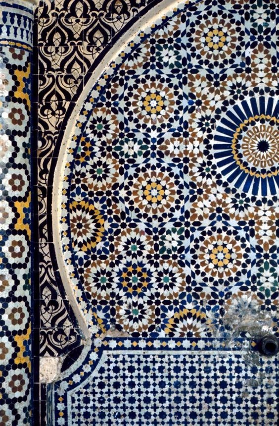
Islamic geometric patterns
To avoid figurative paintings becoming objects of worship, geometric forms are widely used in Islamic art.
From as far back as the ninth century, artists experimented with interlacing lines and stars.
The patterns were more than just decoration. They were believed to be a bridge into a spiritual realm. As the patterns could carry on forever, geometric forms linked to the concept of infinity and the afterlife.
Japan’s Zen philosophy
Zen is one of the many sects of Buddhism, though its ideas have been adopted into everyday culture in Japan. In general, Zen encourages the acceptance of simplicity as a means of fulfilment.
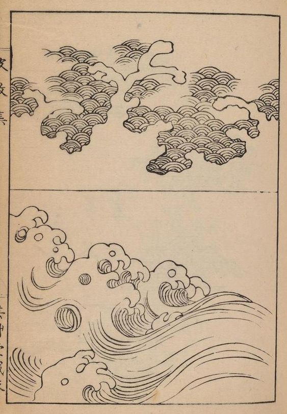
For hundreds of years, Japanese art has embraced the use of negative space or ‘ma’. Ma is where certain areas of a canvas are left blank.
However, these spaces are not considered to be empty. Instead, they help viewers better understand the piece as a whole. Simplicity supports understanding.
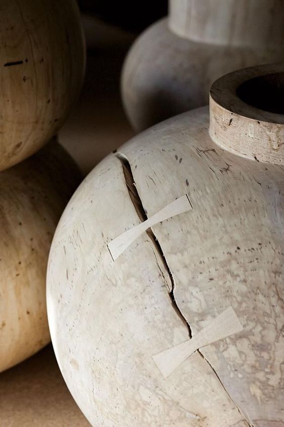
Wabi-sabi is another element of Japanese belief that permeated into art. For example, a simple bowl cracked and put back together references wabi-sabi ideology. It reflects the truth of life – that it is imperfect and impermanent.
It’s clear that artists have pursued simplicity and truth for hundreds of years. The minimalist movement was a new take on those same ideologies.
Minimalism: A design Movement
The art movement may have come about in the sixties, but minimalist design principals were already popular in Europe.
In the mid twentieth century, modernisation was in full force. Life had changed dramatically after the world wars. Class barriers were dissolving, and mass-production was at an all-time high.
Finally, it was possible to create simple but functional objects that everyone could afford. As a result, design changed too. The minimalist aesthetic was born.
Minimalist design principles are still hugely popular today. But, where did it all start?
Minimalist design influences
In the twentieth century, artists, designers, and architects were coming up with new approaches to their work.
Heavy decoration was going out of fashion. They favoured simpler designs so that compositions were easier to understand. The subject of their pieces was what was important.
Here's a run-down of some of those movements.
The Bauhaus movement
In 1919, a German school called Staatliches Bauhaus was created.
Even though the school was open for only fourteen years, it had a lasting effect on design. So much so, that their style became a movement!
Bauhaus aimed to link fine art with functionality. It had a profound impact on architecture, design, and the art world.
Its famous strapline ‘form follows function’ is still a key element of design today. They believed that functionality should come before beauty.
So, what did the Bauhaus style look like?
Bauhaus design got rid of unnecessary ornamentation. It used clean lines, white spaces, and simplified colour schemes.
The designs were functional in that they clearly conveyed their message. But, they were also pleasing to look at. Bauhaus proved that design could be practical and beautiful.
Swiss Design
Swiss Design, or the International Typographic Style, was another mid twentieth century movement.
According to this style, design should be as invisible as possible. What on earth could that mean?
Well, the ‘content’ of work was the focus, not the designer. Like Bauhaus, it was all about conveying a message, rather than just looking nice.
As a result, the movement produced many of the readable typefaces we use today such as Helvetica. They often used white space to help the eye focus too.
Swiss Design even developed graphic design grid systems. Instead of a designer organising content, a mathematical framework could. Using grids meant that information would be easier to understand for the viewer.
Order and cleanliness were key! It was all about the subject matter. Content, the true purpose of a work, was allowed to shine through.
Minimalism in Scandinavian Interior Design
Minimalist ideas are also key to Scandinavian design principles.
Scandinavian design flourished in the 1950s, much like other minimalist movements. As modernisation took place and technologies advanced, there was a growing pull towards the outdoors. Scandinavian design brought nature inside! Just think about it – all those hardwood floors, naturally-lit rooms, and floral motifs. The style we know and love today takes inspiration from the natural world.
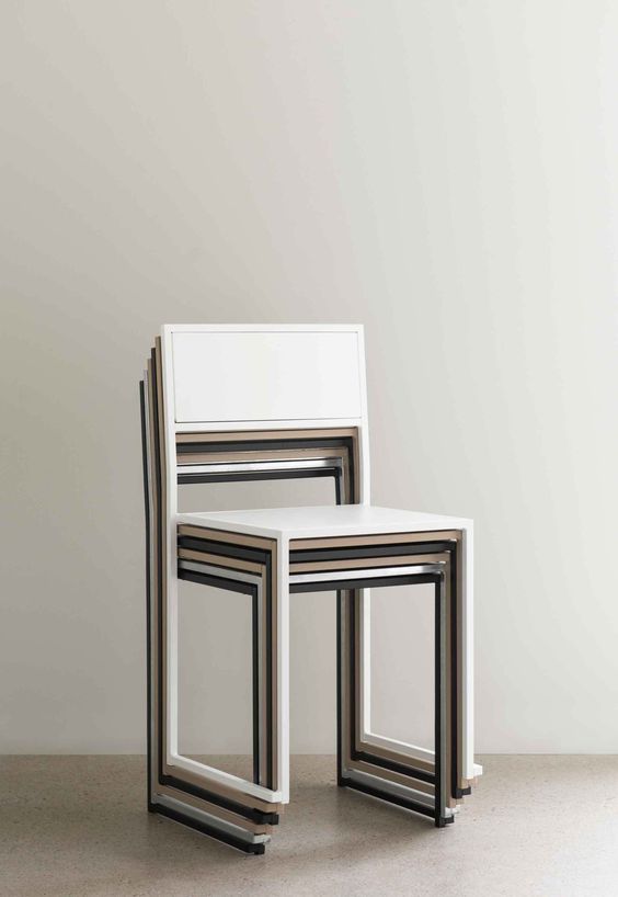
Scandinavian design has a natural approach to interiors in general. How exactly? According to Scandinavian principals, any element of design which doesn't look 'natural' should be removed. Within interiors, this means creating calm, functional spaces, rather than overly-decorated ones.
Functionality is also important in Scandinavian interiors. Practical elements of a room aren’t hidden away. They’re made into design features. Clothes are displayed on simple rails and coffee tables double-up as storage. The use and aesthetic of a room are joined together.
Once more, design is reduced to its simplest form. And doesn't it look beautiful! We have a dedicated article to minimalist interiors. Take a look here!
Minimalism at Project Nord
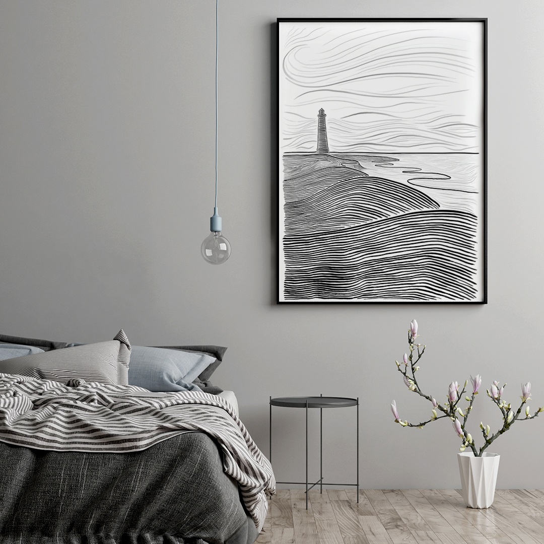
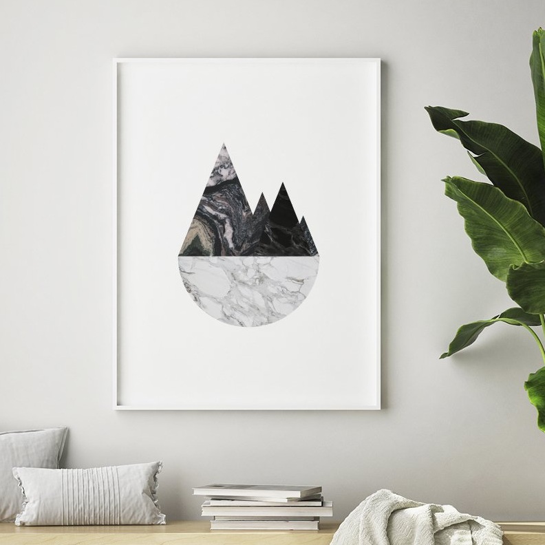
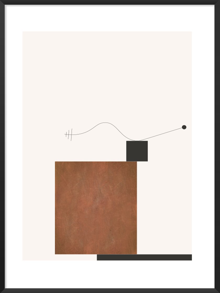
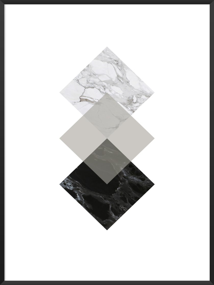
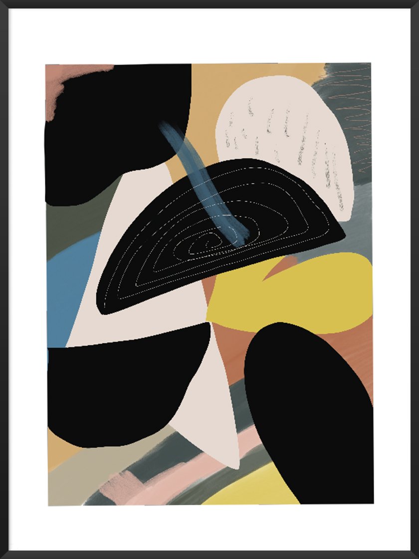
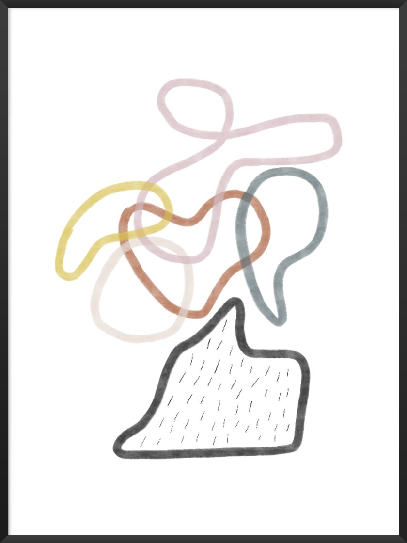
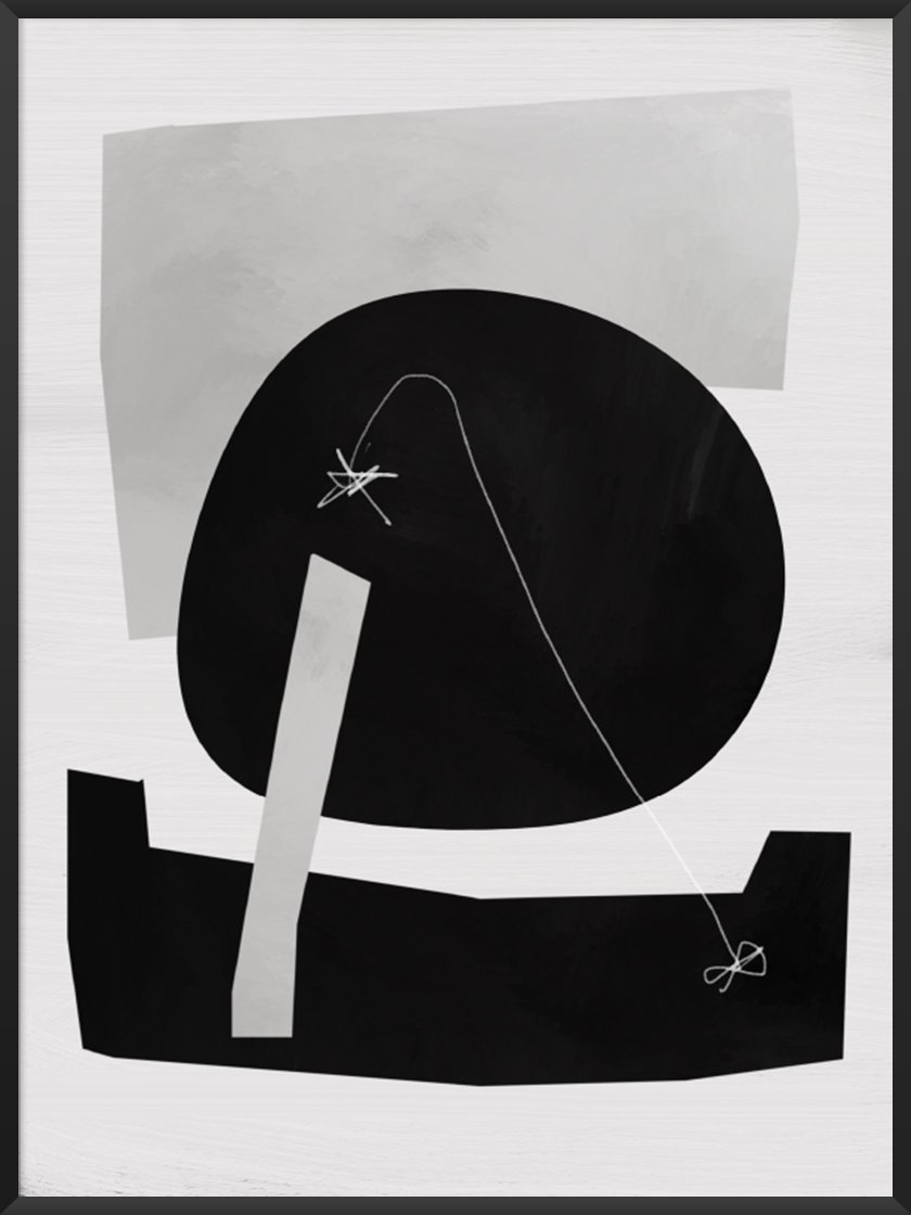
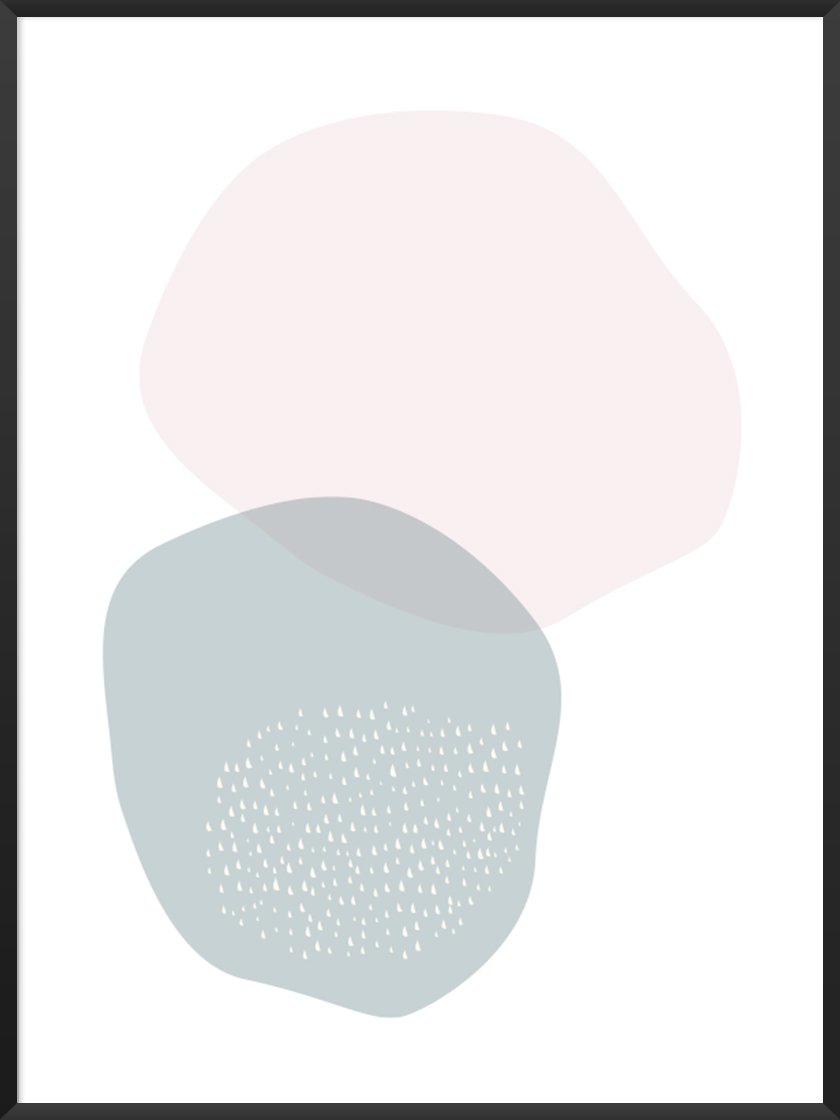
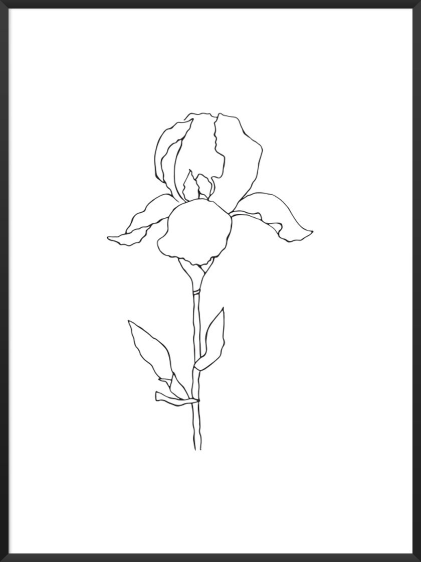
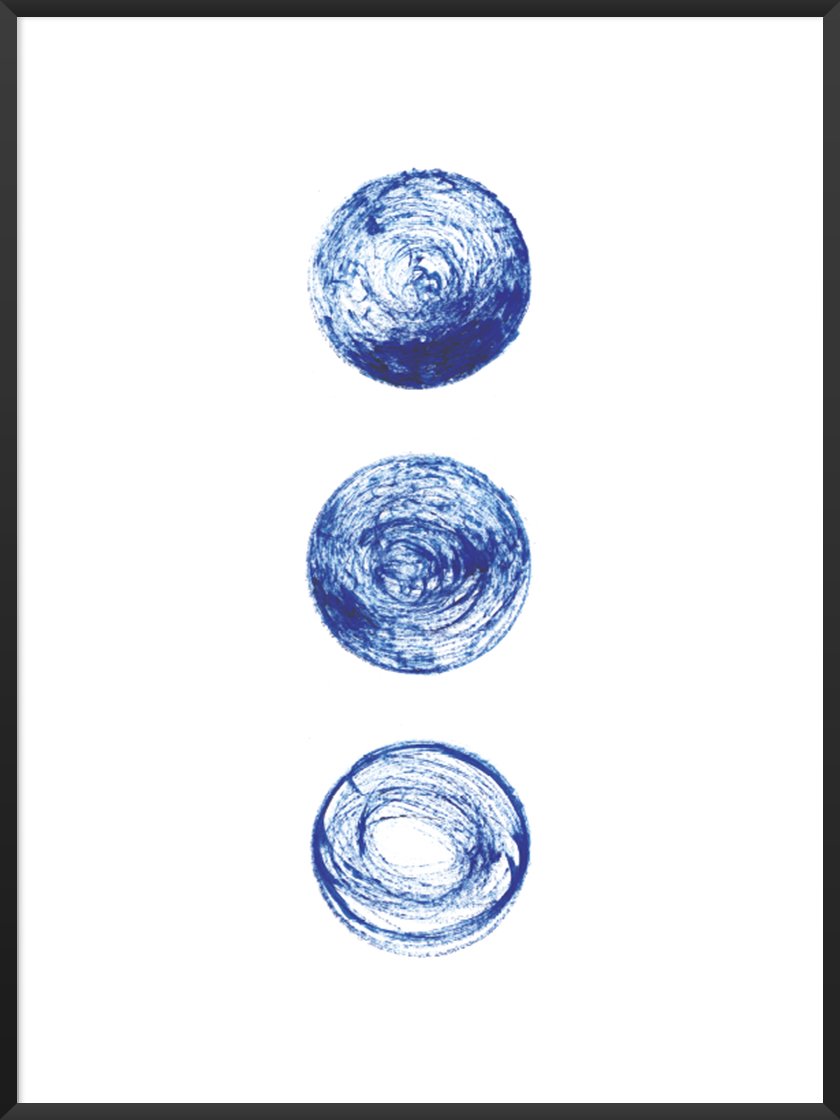
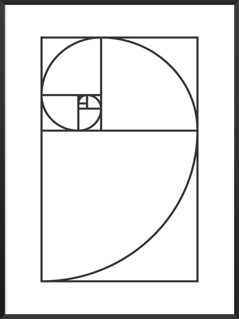
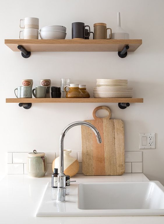
At Project Nord, Scandinavian principals are in our DNA! If you don’t believe us, just look at our posters. Here are some special picks from Project Nord’s collection. We’ve grouped them based on some major minimalist principals. Which would you choose? Click the photos for a closer look.
Geometric shapes
Clean lines and geometric shapes are key to minimalist design. Geometric patterns have been used in Islamic art for centuries. Infinite, interlocking lines were believed to be a bridge to a different realm. Similarly, the minimalist art movement understood that geometry represented simple truth and beauty. What do you think?
Subdued tones
Cool, subdued colours are another hallmark of minimalism. They balance out living spaces beautifully. Grey and beige colours are often used in Scandinavian interiors. Neutral tones are highly functional – they’ll never clash!
White space
Does this remind you of anything? What about that ancient Japanese concept of ‘ma’, where negative space forms part of a composition? By leaving areas of a design blank, the true subject comes into focus. It is simplicity at its very best.
Take a look at the minimalist section of our website for our full collection!
Minimalism: A lifestyle
Now onto the final form of minimalism – the lifestyle!
I’m sure you’re aware of minimalist stereotypes. Lifestyle gurus who throw away their belongings and live in bare, white-walled homes? This might be true of some minimalists, but certainly not all of them.
Most people think that minimalism focuses on possessions, or on getting rid of them. In reality, it’s about much more than that. Adopting a minimalist lifestyle means questioning what’s really necessary to be happy.
Of course, sorting through material objects is part of the process. But, our immaterial baggage is just as important to consider.
So many of us carry excess stresses, pressures, and expectations. Sometimes, we just need to let go. Minimalism helps us get back to ourselves and lead a more fulfilled life.
Before we get into minimalist lifestyles, we wanted to tell you we have a 30 day minimalist challenge so you can have a go at living with more meaning! Download it, print it, and stick it to your wall!
Where did the minimalist lifestyle come from?
It’s important to note that minimalist lifestyles are not new. Many religious texts encourage the idea of simple living – reducing our possessions and increasing self-sufficiency. Christian and Buddhist texts suggest that simple living helps followers gain spiritual focus.
These concepts existed outside religion too. Henry David Thoreau, an American naturalist and author, advocated the same ideas in his book Walden (1854).
Thoreau reflected on the merits of living simply in natural surroundings. He touched on many key minimalist ideas, such as self-reflection and seeing through daily worries to the truth of life.
The rise of mass-consumerism also awoke minimalist counter-trends. Since mass production developed, costs came down and everyone accumulated more and more belongings.
But were people happier, now they had more stuff? Dissatisfied, some decided to revert to the earlier, simpler ways of living.
In the 1990s, the voluntary simplicity movement was pushed into the public eye by the book The Simple Living Guide by Janet Luhrs. It promised that by slowing down and cutting away excess, life would be more enjoyable.
What is a minimalist lifestyle today?
Nowadays, minimalist life choices are becoming more and more popular. It’s not necessary to overhaul everything. We can make small changes that leave us feeling happier. We all know we have too much stuff, go on our phones excessively, and should really spend more time outside. But, what would actually happen if we lived more minimally?
Having fewer belongings means we feel less overwhelmed
With so many useless belongings, it’s easy to feel overwhelmed. The things we really need are harder to find and cluttered spaces are difficult to relax in.
Try clearing through your belongings and see what effect it has on your wellbeing. By prioritising objects which add value to our lives, we create spaces which are calmer and more functional. If you’d like some help, take a look at our Ultimate Decluttering Guide! It contains all the tips you need for the ultimate clear out.
Minimised damage to the environment
It’s important to consider the value of an object before buying it. Mostly, that gives us time to realise we don’t really need it.
By slowing down our consumption, we’re reducing our impact on the environment. It’s estimated that 50% of all pollution results from industrial and manufacturing activities. So, if we reduce the demand for new products, the environment gets a well-needed rest. We have loads of articles on sustainable living, such as our 6 Things You Can Do Today to Be More Sustainable article.
More time to do the things we love
Remember, minimalism is a lifestyle, not just a decluttering method. Sorting through your life also means sorting through the things you spend your time doing.
Get rid of unhealthy habits like being glued to your phone. Does spending that extra hour at the office each day make you happy, or just stressed-out? Your time is valuable! So you should spend it doing the things you love.
How to become a minimalist
So, have you decided it’s for you? Follow these simple steps to begin your journey towards a more minimalist life.
Buy higher quality items
Look out for high-quality options when you go shopping. That beautiful pair of trousers made from hard-wearing fabric? That solid wood shelf which would work perfectly in your study? Invest in things that will last longer and make you feel happier in the long run.
Get handy
A key element of minimalism is valuing the things you have. Sometimes, that means extending the life of objects you already own. If your shirt loses a button, sew another one on. Try repairing a radio before you throw it away. Not only will this save you from buying new things, it will give you a sense of fulfilment when you get the job done yourself!
Review your diary
If you always have a busy schedule, then this one’s for you. So many of us spend our time doing things we don’t care about. And, time is the most valuable resource on the planet! Take a look at your diary and make sure you dedicate time each week to doing things that make you happy.
Minimalism is a big part of Project Nord culture in a number of ways. We love minimalist design, particularly because we’re a Scandinavian company. However, we also have a minimalistic approach to the way we use resources.
If you’d like any further information on Project Nord’s minimalist practices, take a look at our sustainability page. After that, why not browse through our beautiful collection of minimalist posters. We’re sure you’ll find a design which adds value to your life.
Written by Jessica Slater.
Images sourced from Pinterest and Project Nord website.


![Frank Stella, [title not known] (1967)](https://images.squarespace-cdn.com/content/v1/5cf6959864dfad0001763314/1562324572792-53AUJ7B2W1RZXHFVSYLD/Everything+about+Minimalism.+Image+of+Frank+Stella+Piece%2C+1967)
