Behind the Scenes at Project Nord: How to Make a Poster
Have you ever wondered about the work that goes into designing posters? Or, have you ever wanted to know more about the artist behind the prints?
At Project Nord, we have a team of artists from around the world who all love Scandinavian design as much as we do. Here’s your chance to see their work in action! We’re giving you an exclusive look at how to make a poster. First follow our step by step guide and then see the work in action. Take a look!
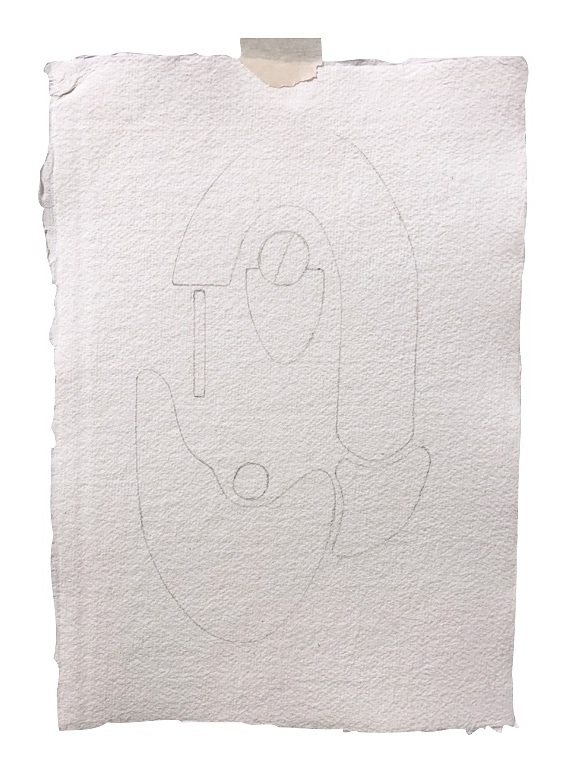
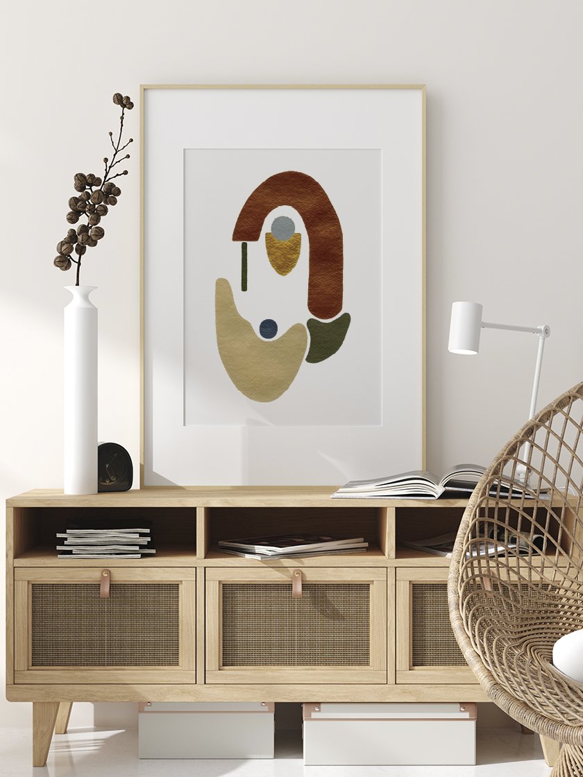
Our Connection Poster in the making! Design by artist Ayse Sirin Budak.
Step by Step Guide: How to Make a Poster
Here’s your quick and simple guide of how to make a poster. Enjoy!
Find a topic you want to illustrate
Is there a photo you’ve taken recently you love the look of? Or maybe, you’ve been commissioned to create something visual! If you’re stuck for ideas, go to Pintrest or Instagram to see the latest trends.Make a mood board
Find images that match the colours and style you have in mind. Remember though, never copy an existing artwork. This step is just great for developing your ideas.Pick your tool
Do you want to create your poster by hand or digitally? Whichever of these you choose, there are loads of options. Just think - pencils, paints, charcoals, pastels. Digitally, there’s software you can use to replicate almost all of these effects as well.Make sketches
Doodle and see how your ideas come out in real life. This is your time to get experimental! So, don’t worry if things aren’t exactly how you imagined them. This is your time to be free!Decide on a final design
Choose which of your sketches is your favourite and make it up into a final design.Finish up
If you made your poster on a computer, then it is complete! If you made it by hand, all you need to do is scan it into a computer. You may want to use software like Adobe Photoshop to get rid of any mistakes or smudges. Save it, and you’re all done!
Now, let’s take a look at how we made our best-selling posters!
Love is in the Air Poster
Our very first collection at Project Nord was based on typography! So, these posters have a special place in our heart.
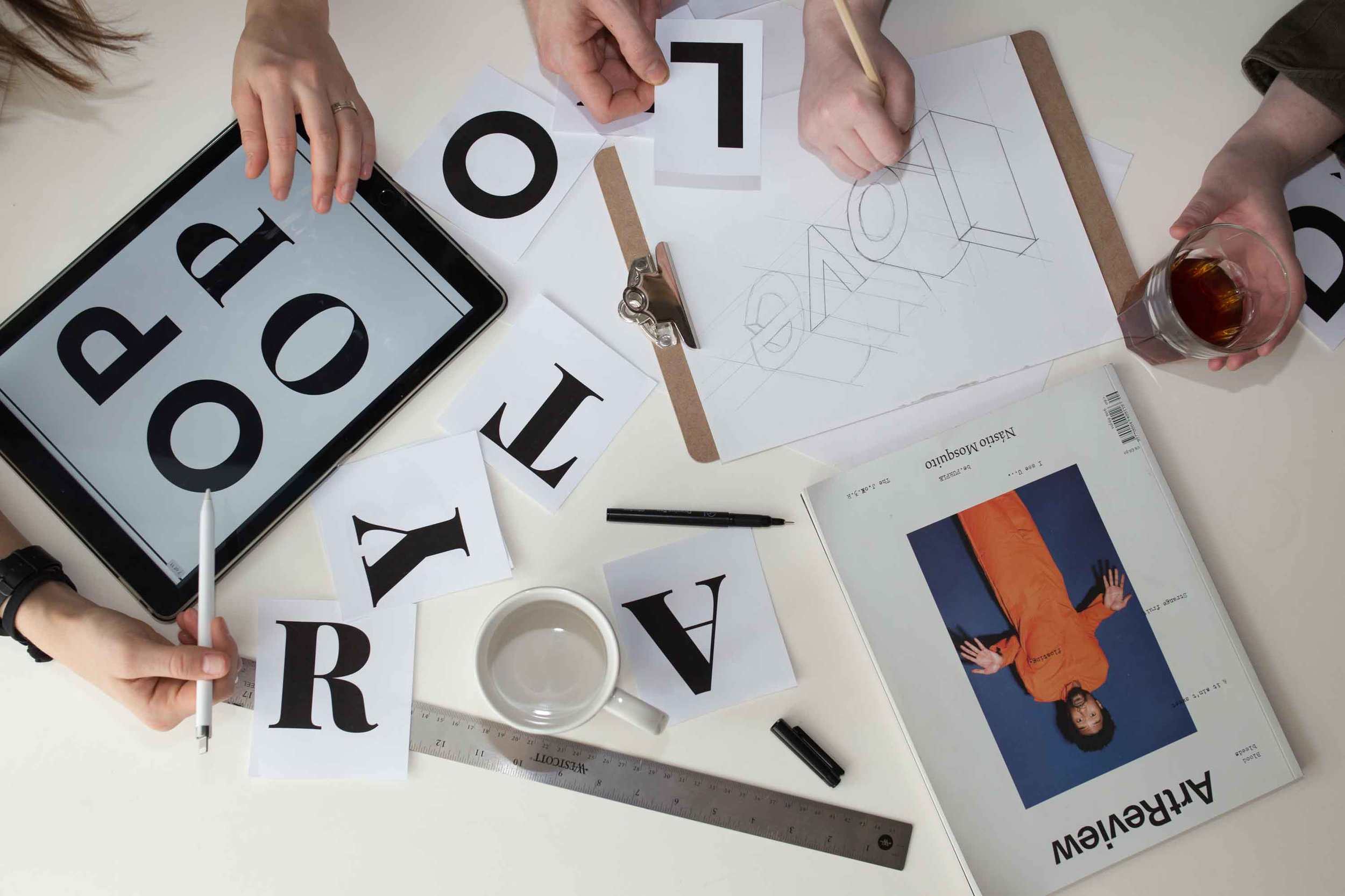
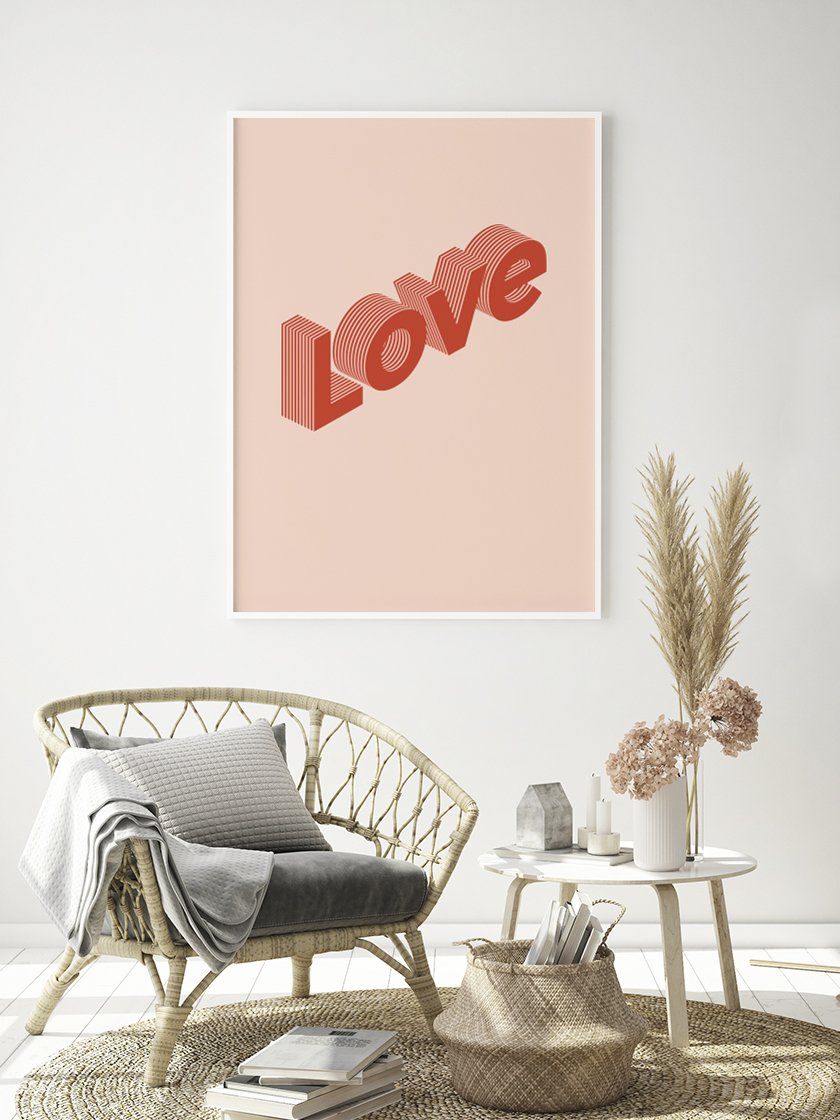
Here, you can see graphic designer Laura Hummel drawing an initial sketch of her Love is in the Air poster. The design is based on swiss typographic style, a movement created around the mid 20th century. If you’d like some in-depth information on it, then check out our article all about minimalism. Swiss typography strips back typefaces so they’re left in their cleanest form. The words’ message is most important, rather than any decoration. And, as you can see here, Laura’s message is very clear!
Laura used the typeface ll unica77 from Art Review magazine’s logo as a reference. The original version of this typeface Unica was first created in the late 1970s. Unfortunately for the designers, it was released just before a major technological revolution in the typographic world - just before desktop publishing! That meant that it wasn’t in the digitised format which made typefaces accessible to all. Unica was later pulled from the market thanks to legal disputes and only made a reappearance in 2015! Now, there are two versions of Unica. There’s this one, that Art Review uses, and a different version called Neue Haas Unica. Each typeface came from a different side of the legal battle. Which one do you prefer?
After drawing out some initial sketches, Laura completed digital versions on her iPad. She then finalised her work on Adobe Illustrator and you have the poster we see today!
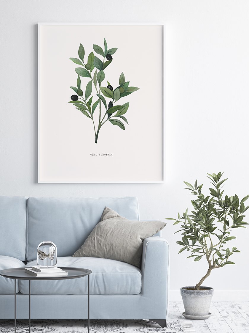
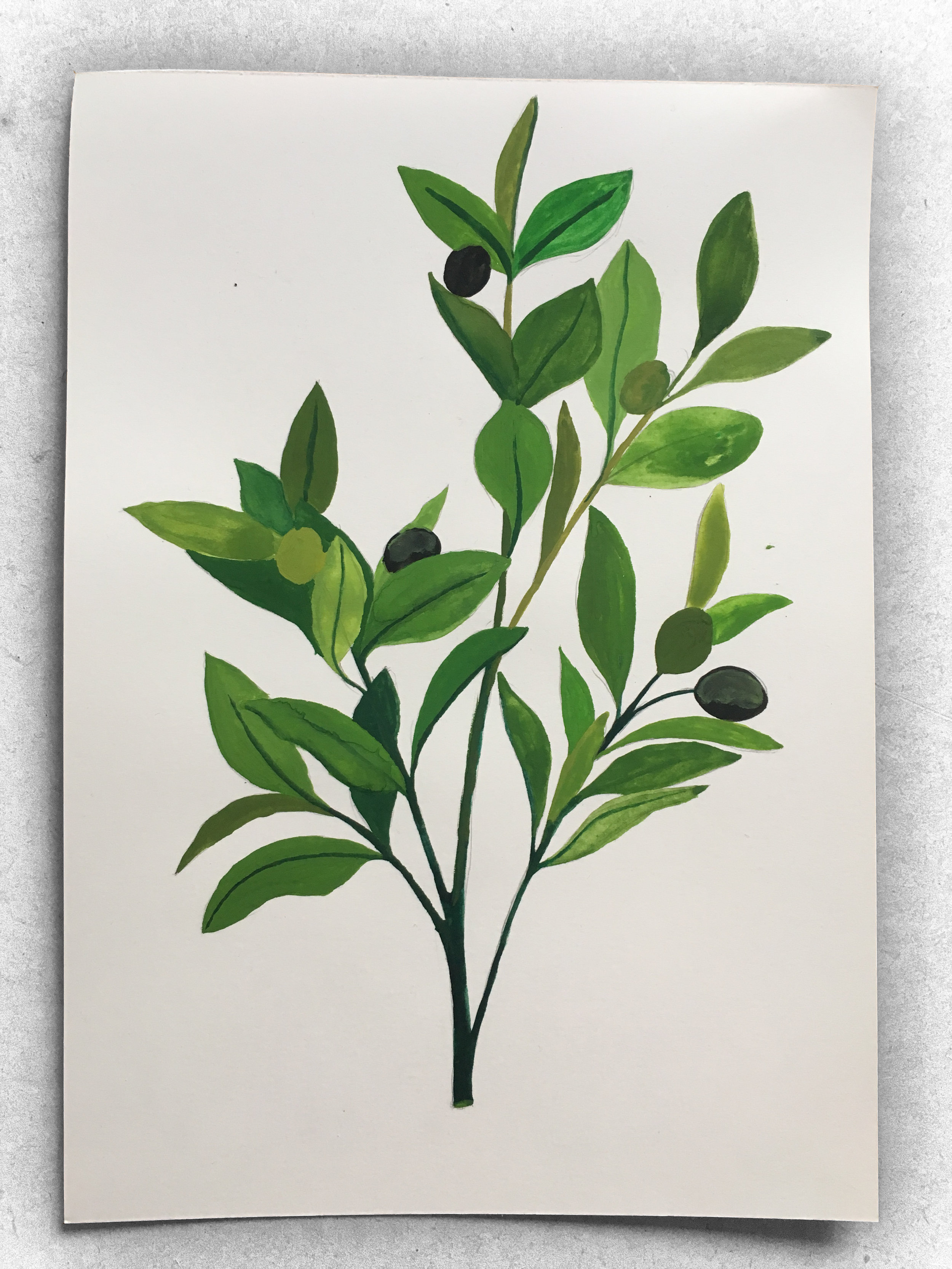
Olea Europaea Poster
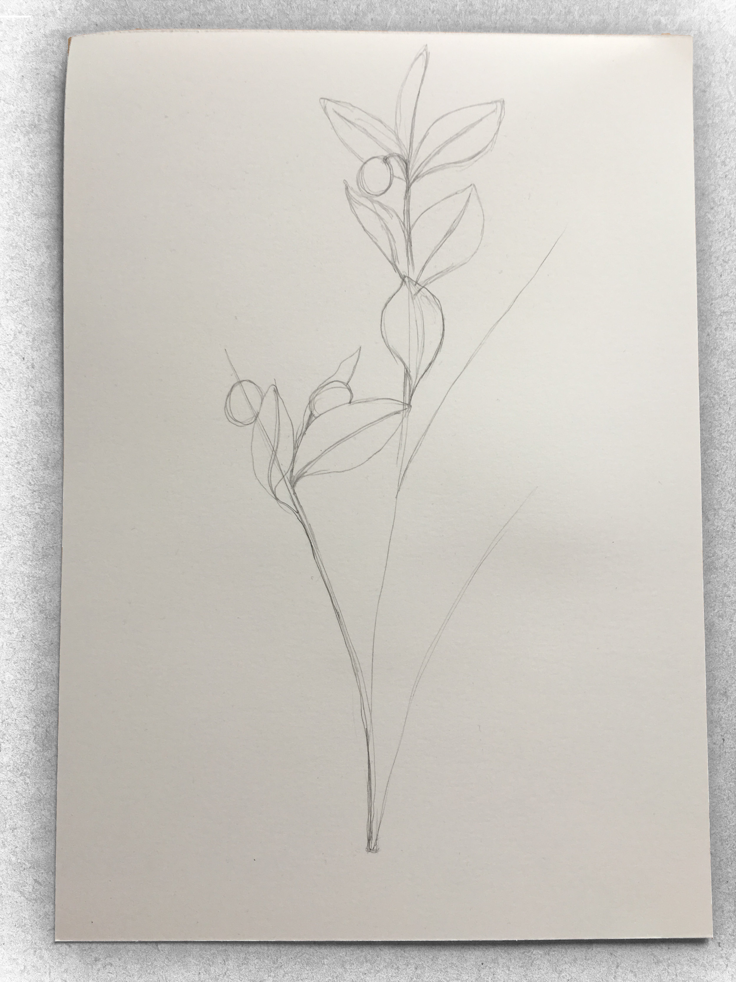
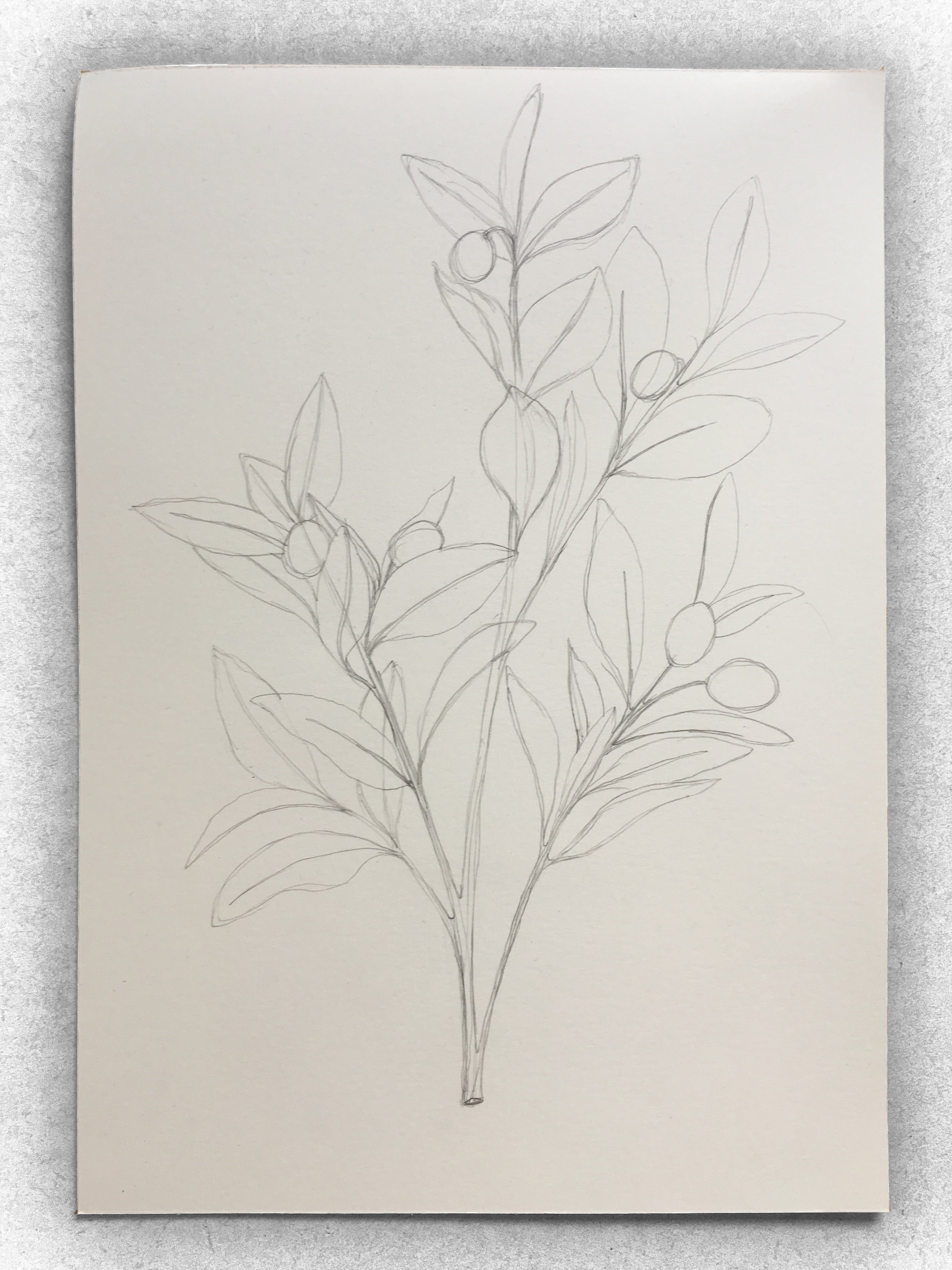
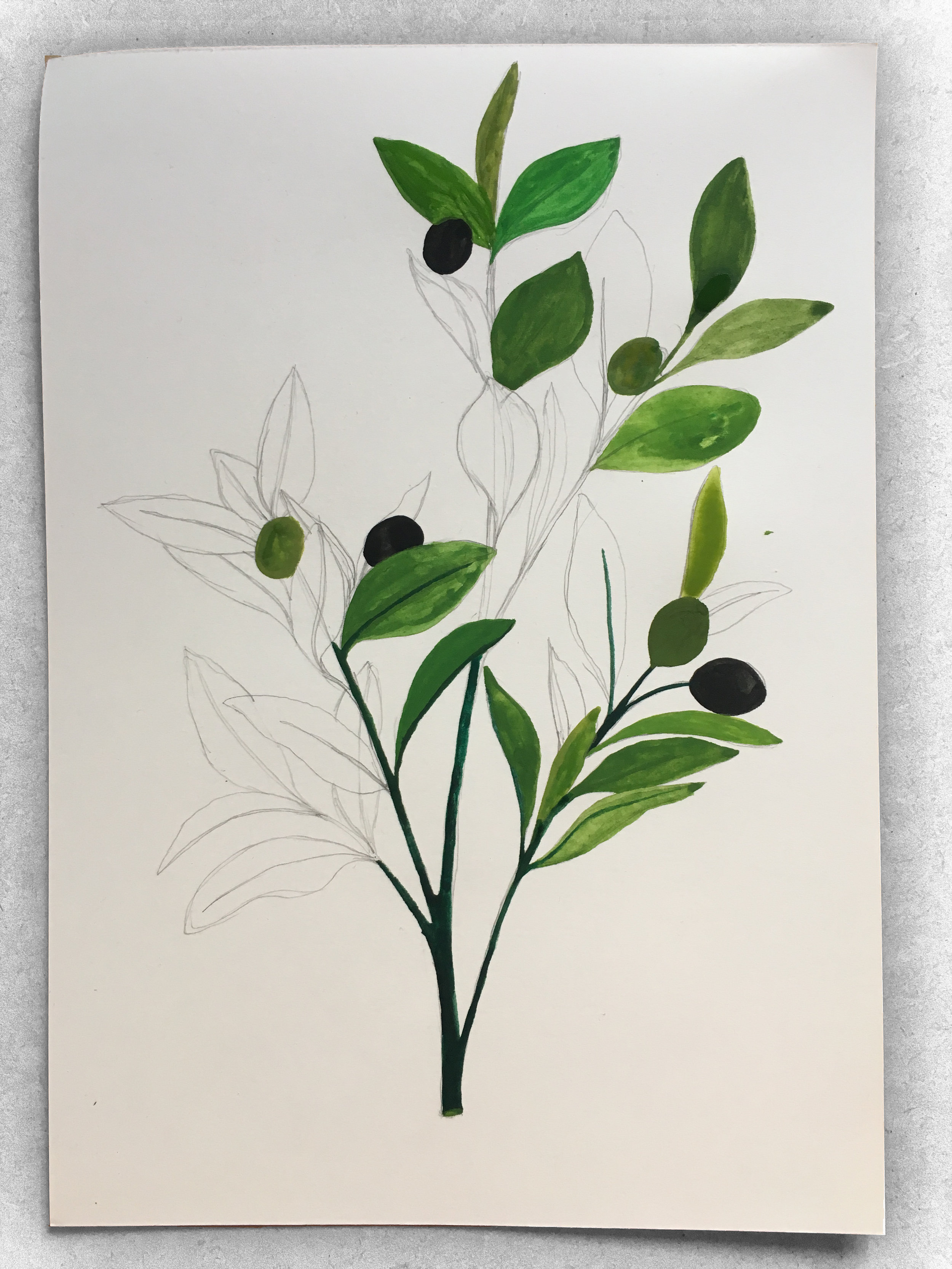
Next up, we have a hand-painted piece from our Botanical series. This is Project Nord’s Olea Europaea poster, designed by artist Maddie Powell.
In the images, you can watch the progression from blank page to the finished poster! Maddie used watercolours to paint her design. And, we think the effect is brilliant! After she finished painting, Maddie scanned her painting into a computer to digitise it. Creating posters this way makes them feel special. You can even see individual brushstrokes!
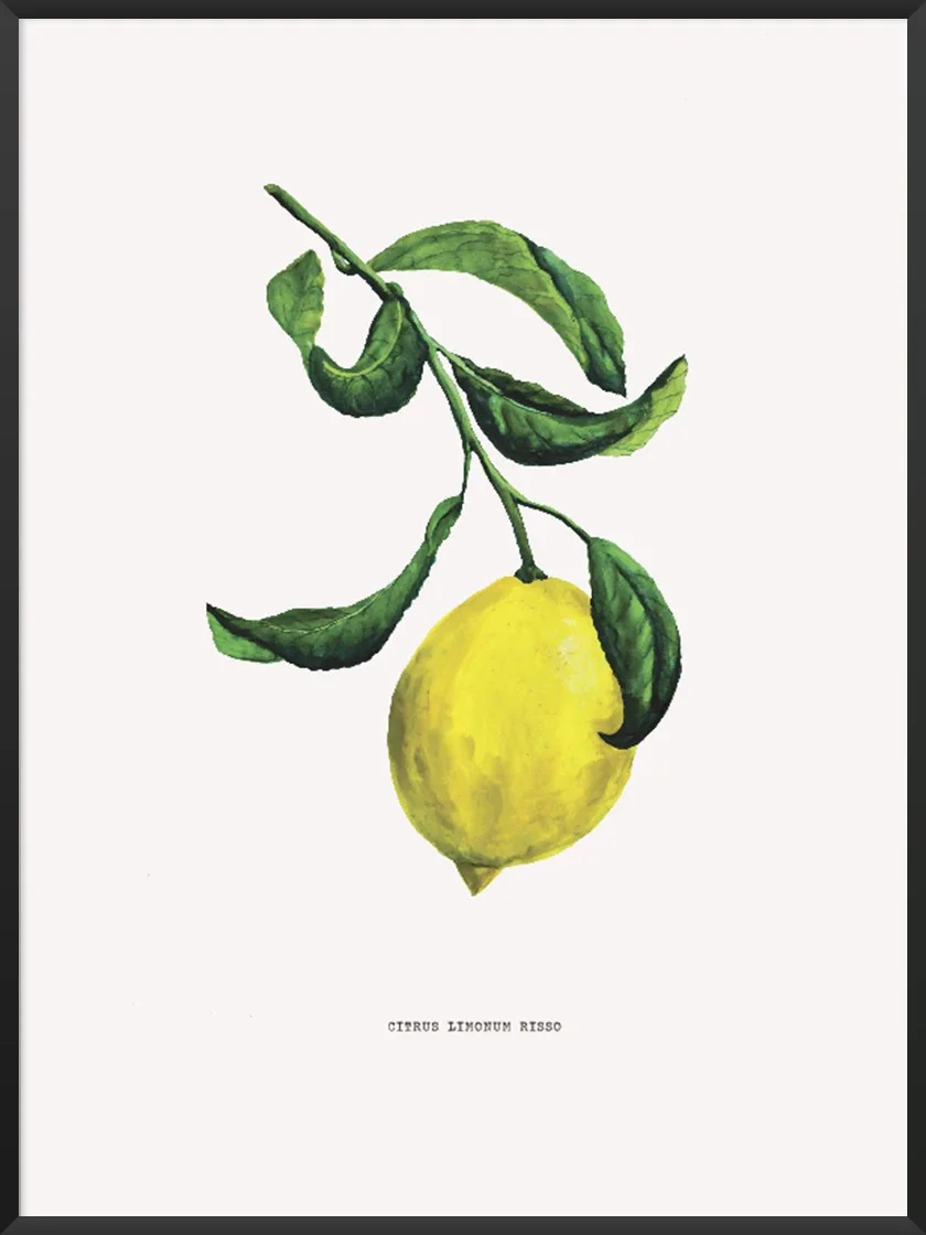
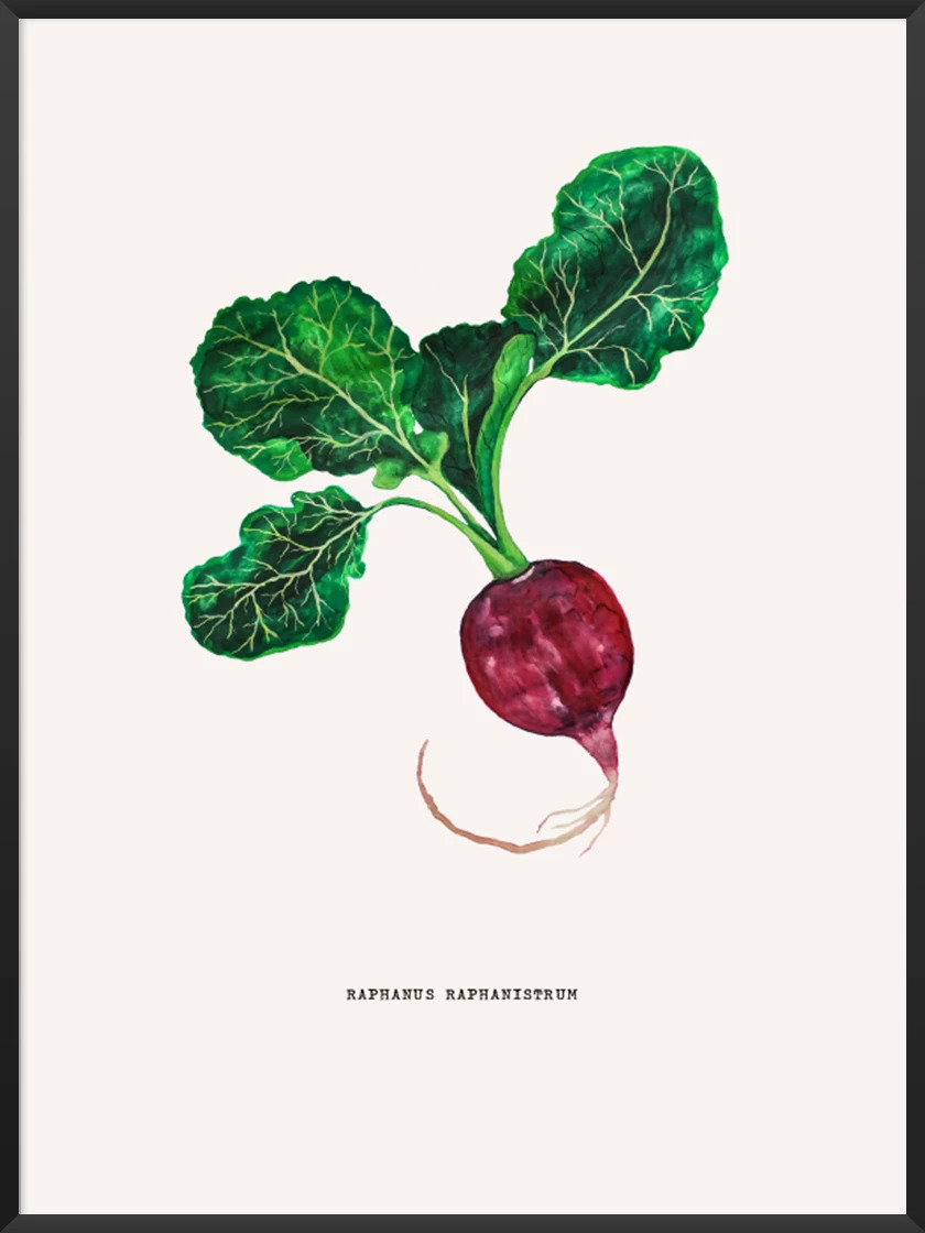
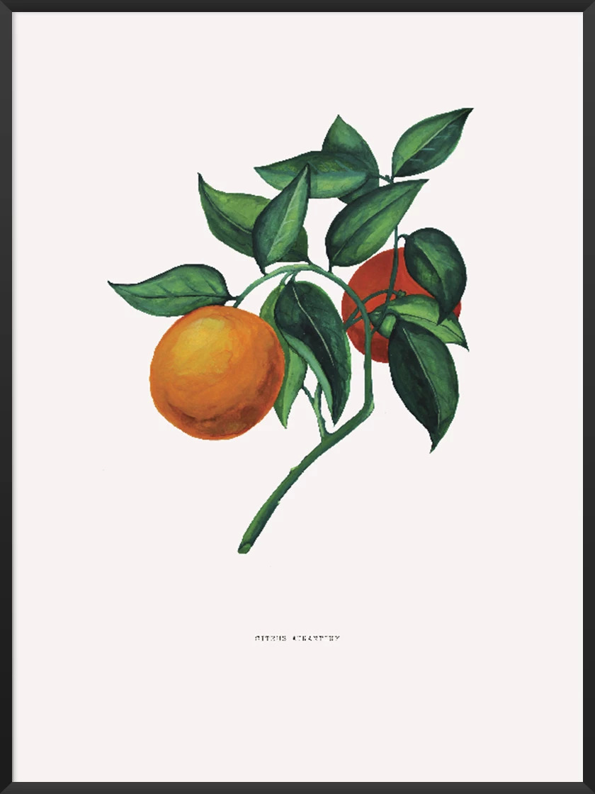
Maddie finished the design by adding the typewriter-style title on Adobe Photoshop. She chose to label each of her posters with their botanical names. If you like the Olea Europaea poster, check out Maddie’s other botanical designs below! Click to see them bigger!
The Walking Fox Posters
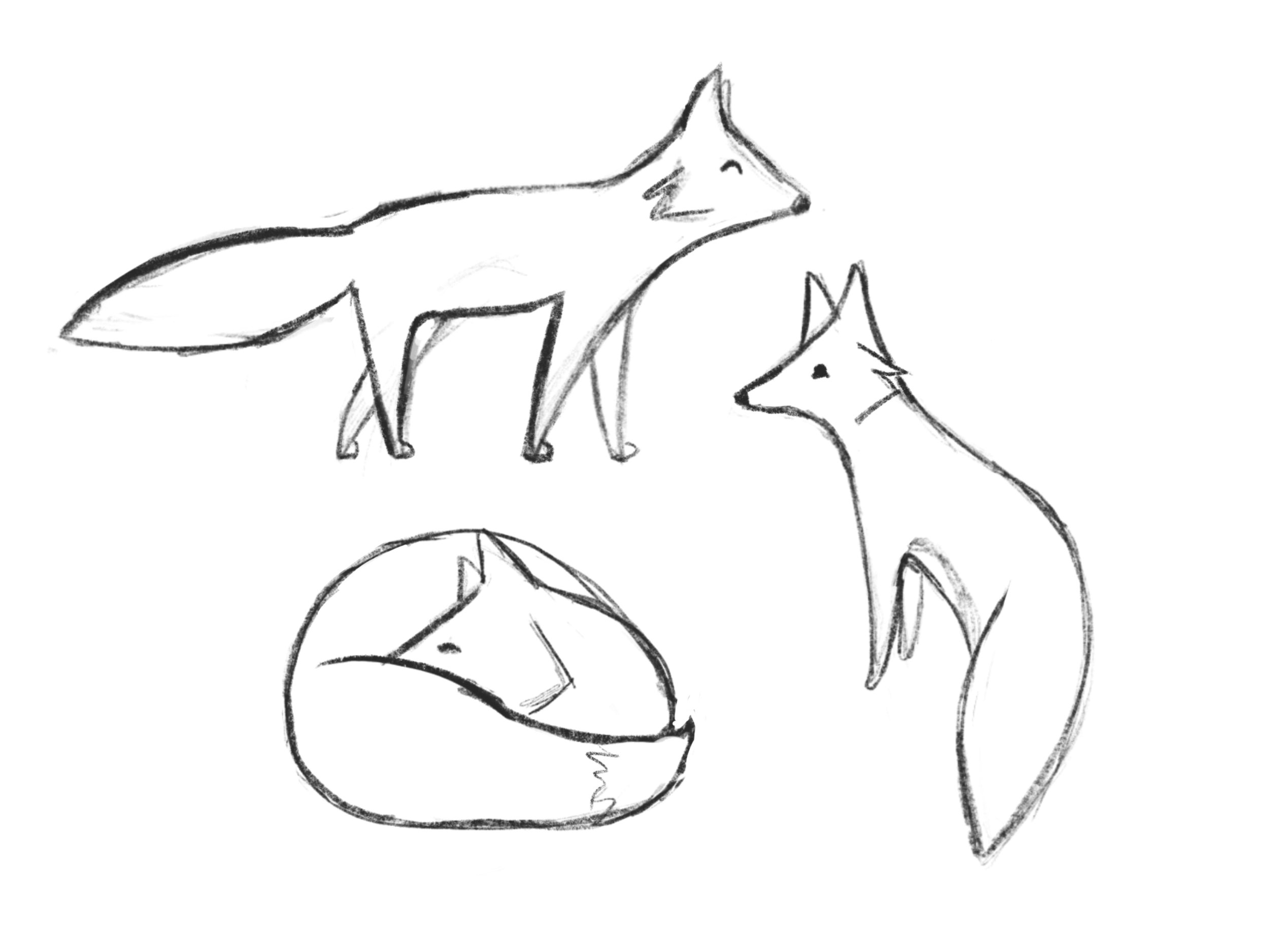
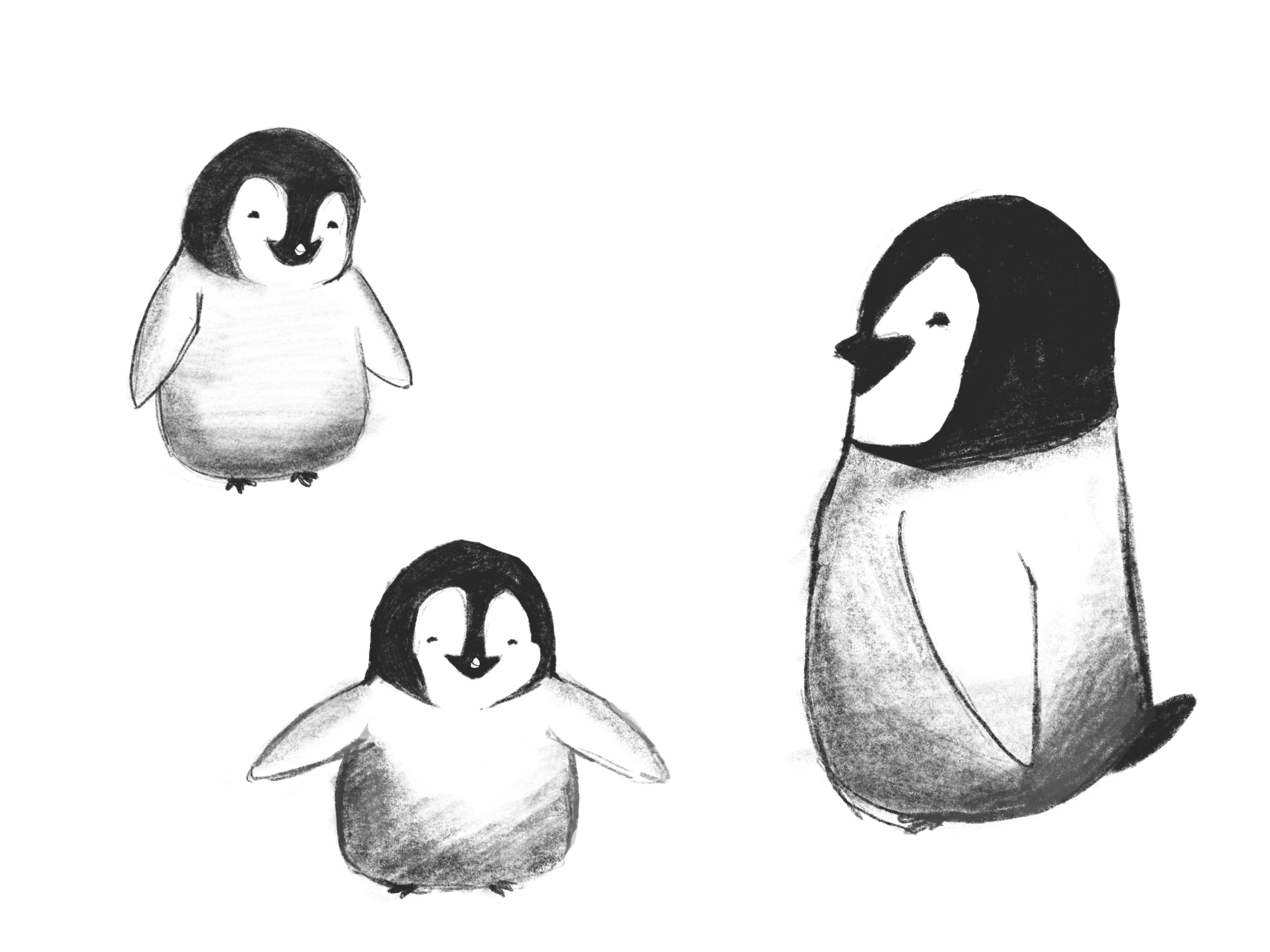
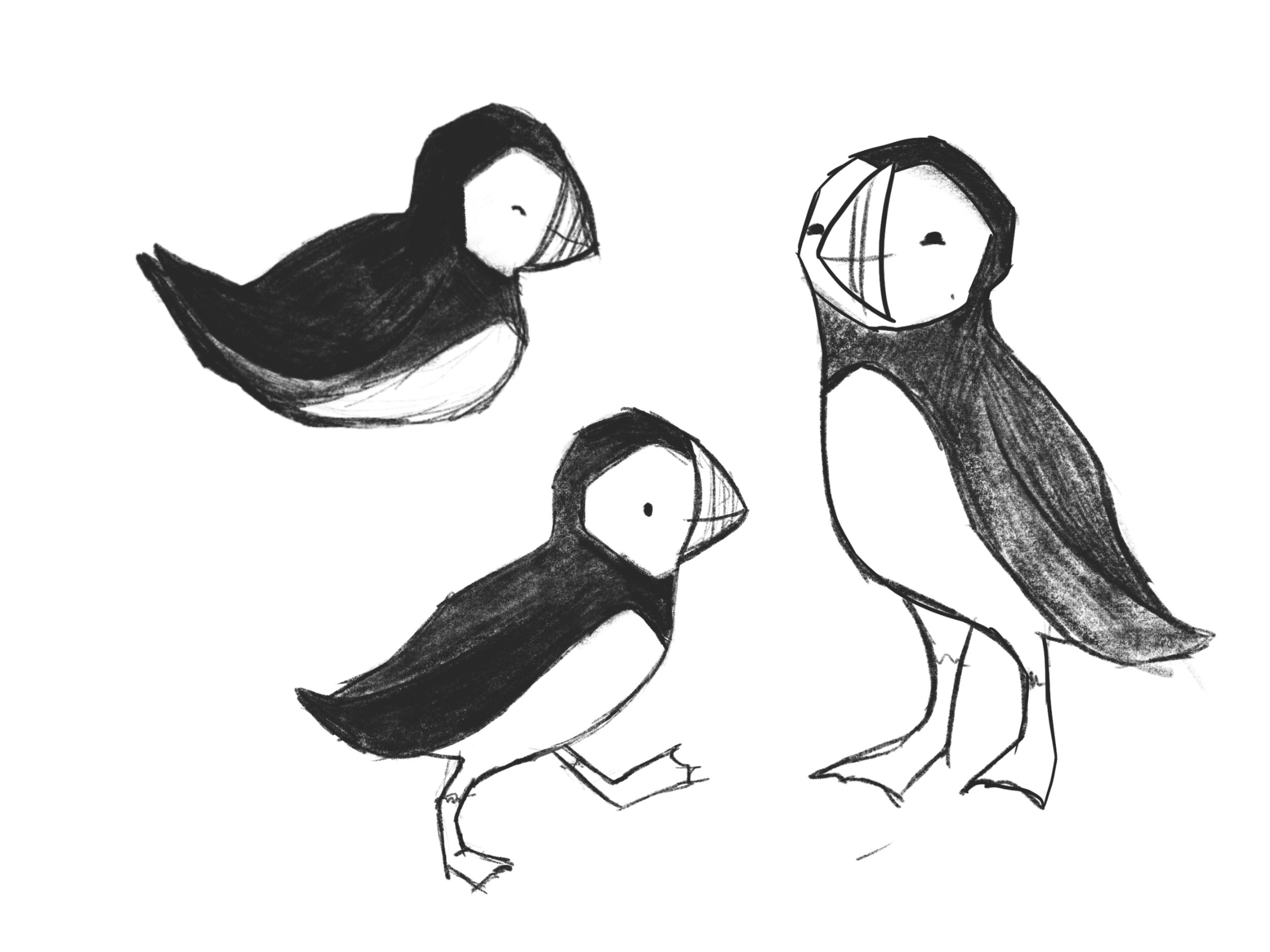
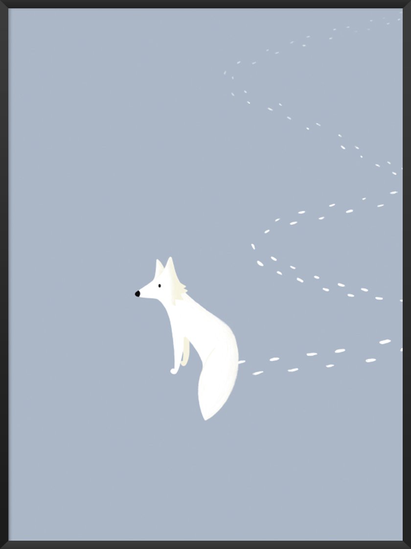
Next up, we have something cute for you! Here are some initial sketches by artist Louisa Sarah Soellner. She experimented with the theme of Arctic animals to create some lovely, children’s room artworks. They’re just so lovely! Believe it or not, these sketches were done on iPad.
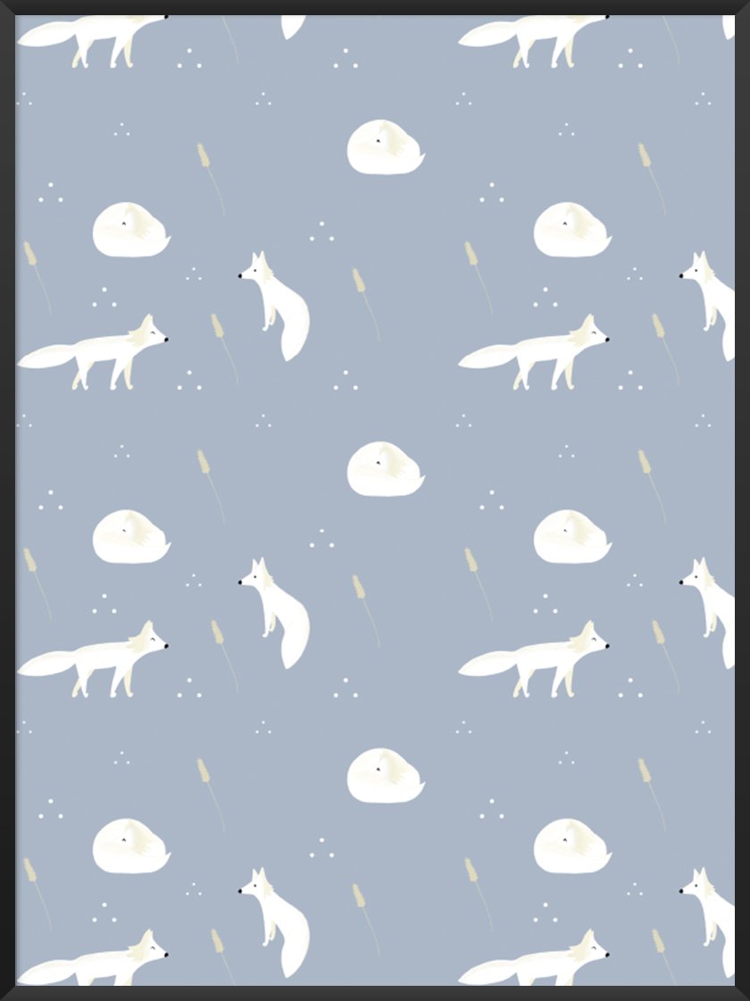
After the sketches were complete, we agreed with Louisa that the Arctic fox design was her best. Still on her iPad, Louisa transformed her sketches into poster designs. And, these posters are amongst our most popular!
We hope you enjoyed your behind the scenes access to Project Nord. Each of our posters are thoughtfully crafted for the designs. Did you know there was such a process behind each poster?
Written by Jessica Slater
Images sourced from the Project Nord website and the artists themselves.

