
Everything You Need to Know About the Swiss Style

Are you a person who loves order? Do you agree that less means more?
If so, come look into the graphic style that’s been around for almost a century and doesn’t plan to go out of style.
So, what is this Swiss Style?
The Swiss Style is a graphic style which follows the idea of minimalism and perfectionism.
Sounds lovely, hey? This style of graphic design goes by several names. You might hear it referred to as:
Typographic Design Style
Swiss Typographic Style
International Typographic Style
The key characteristic of the Swiss Style is the clear organisation of elements according to a grid system. And, aren’t you lucky? At Project Nord we have a whole collection of Swiss Style posters for you to choose between! But first, let’s learn exactly what this style is about!
Once upon a time, Swiss Style was born...
The Swiss Style appeared in the 1920s in Russia, The Netherlands, and Germany. Today we know it as Swiss Style because it was designers from Switzerland who made the graphic style acclaimed worldwide. In particular, Josef Müller-Brockmann is the person to mention as he was the head figure in the style evolution. He’s recognised for his use of clean shapes, colours and typography, which is indeed what the Swiss Style is all about.
It’s detail-oriented, precise, tidy and demanding in the best way. Not only is this the description of a Swiss person but also of the typographic style we’re discussing. The Swiss have put their high-end characteristics into the typographic style before it was exported worldwide in the 1960s and received its international stamp.
“Less is more”, said every Swiss Style poster always!
The style goes the opposite way of the universal belief that work is perfect when there is nothing to add to it. In this case, the work is ideal when there is nothing to remove from it. This concept helps keep works as orderly as possible. Some would say it’s a minimalist’s dream!
Choosing distinct and clear-cut figures, strong colour schemes, contrasts, and bold typographic choices, it’s a highly logical and purpose-oriented information presentation. The beauty of the style is to point out the purpose, not the beauty itself. It’s more practical than the visual. Swiss Style posters serve their function in transferring the information from the artist to the viewer in the clearest way possible.
Swiss Style prefers staying on the grid
Designers working with the Swiss Style often use a grid. It’s a helpful tool to maintain order in the design. Josef Müller-Brockmann was not only a notable promoter of the Swiss Style itself but also the one to put the core ideas of grid structures in design, as well as spreading the idea around the world. Nowadays every smartphone offers to take a picture with a grid to measure the precision of the picture’s position. In Swiss Typographic Style, grids are in use not only to keep order on the artwork but also to arrange the words in the most readable way.

An example of Josef Müller-Brockmann’s monospace typeface design.

Geometry and art went for a walk...
Even at the first glance at Swiss Style designs, the presence of geometric figures, drawings and patterns remain undeniable. Graphic artists have gone out of their way to express themselves in a neat and tidy fashion. The endless experiments with abstract figures, indulged by contrasting colour schemes and text manipulations are telling a story in a striking way.
The message has been delivered
A specific characteristic of Swiss Typographic Style is an information arrangement in a manner for the viewer to catch the most important information first. In other words, it creates a hierarchy of the presentation of data. Designers accomplish this by enlarging the words or sentences they want to show the viewer first. By layering the text, using font size, the human brain is unconsciously reading it from the largest to smallest, as the largest words are easiest for the brain to grasp.
Because of this method, the Swiss Style is still relevant for advertising nowadays. Companies are able to draw the attention of customers by enlarging an eye-catching phrase or word, after which they have to concentrate to see what sentences smaller font letters draw together.


Helvetica is the sweatpants of typefaces /John Boardley
When you think about it, typefaces are such a huge part of visual communication. Some would even say that it is the core of it. Indeed, it’s the shortest route for the message to reach the recipient. Many artists use sans-serif typefaces when creating a Swiss Style design. Sans-serif is a category of typefaces that do not use serifs - small lines at the ends of characters. If you are feeling lost on what typefaces are, here is our ultimate typography guide, that we suggest you look into. The idea behind the choice of sans-serif in Swiss Style is that the fonts are straightforward, without being over-accessorised. Similar to geometric shapes and figures, sans-serif fonts are single stroked, bold and direct. The most frequent typeface in Swiss Style is Helvetica because of the simplicity of it. Helvetica typeface uses straight lines and curves, which go hand in hand with the whole idea of the Swiss Style simplicity.
And The Winner Is...
When viewing a Swiss Style design, it might appear familiar to nearly everyone. The Swiss Typographic Design has the power to deliver the message to people from different backgrounds and, therefore, parts of the world. The motive for that being the straightforwardness and directivity. The typographic style is in use for artworks that are to reach large numbers of people. It might be the rationale of why the style seems so familiar to many.
Let’s take a closer look!
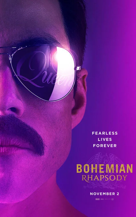
Loads of movie producers use the Swiss Typographic Style graphic design to create movie posters. The movie about legendary musical band Queen, which came out in 2018, also created a Swiss Style poster.
Let’s take a look at this poster and indicate the Swiss Style characteristics that we have been talking about.
The most important message - the name of the movie “Bohemian Rhapsody” is written in larger font size than the rest of the text. Except for the name of the band “Queen” that shows up in the reflection of sunglasses. However, the contrasting colour draws your eyes directly to the “Bohemian Rhapsody” part.
Most of the text is written in a sans-serif typeface, without the small lines at the ends of letters, as well as using straight lines and curves.
The text has been arranged proportionally. It’s not hard to imagine where the grid lines would appear in the poster.
Even at first glance, it’s obvious that there’s a very minimal amount of information on this poster. The symbolic meaning of moustache and sunglasses of lead singer Freddy Mercury says a lot on its own.
Swiss Style is so often used! Now, you will be able to spot it around you!
You can find patterns and ideas of Swiss Style nearly anywhere around you. Next time when stepping outside and strolling through the city streets, keep an eye out for Swiss Typographic Style patterns on posters and signs. Now, when the concept is familiar, you might be surprised by how much of the design is around you.
What about the walls in your home? Can you spot some Swiss Style designs there? Have a look at our posters and, once they are a part of your interior, it can be both a conversation starter, as well as a way to show your knowledge in graphic design arts.
Written by Maija Jekabsone
Images sourced from Pinterest and the Project Nord website.